*Introduction **Current Gossip ***Work
*
Hello and Welcome to:
The website of Johanna Ehde
A graphic designer based in Amsterdam
Part of Rietlanden Women’s Office
For design related inquiries please forward a message to the following address, email or phone:
Minahassastraat 1
1094 RS Amsterdam, NL
johannaehde(a)gmail.com
NL +31 (0) 616 70 64 70
**
***
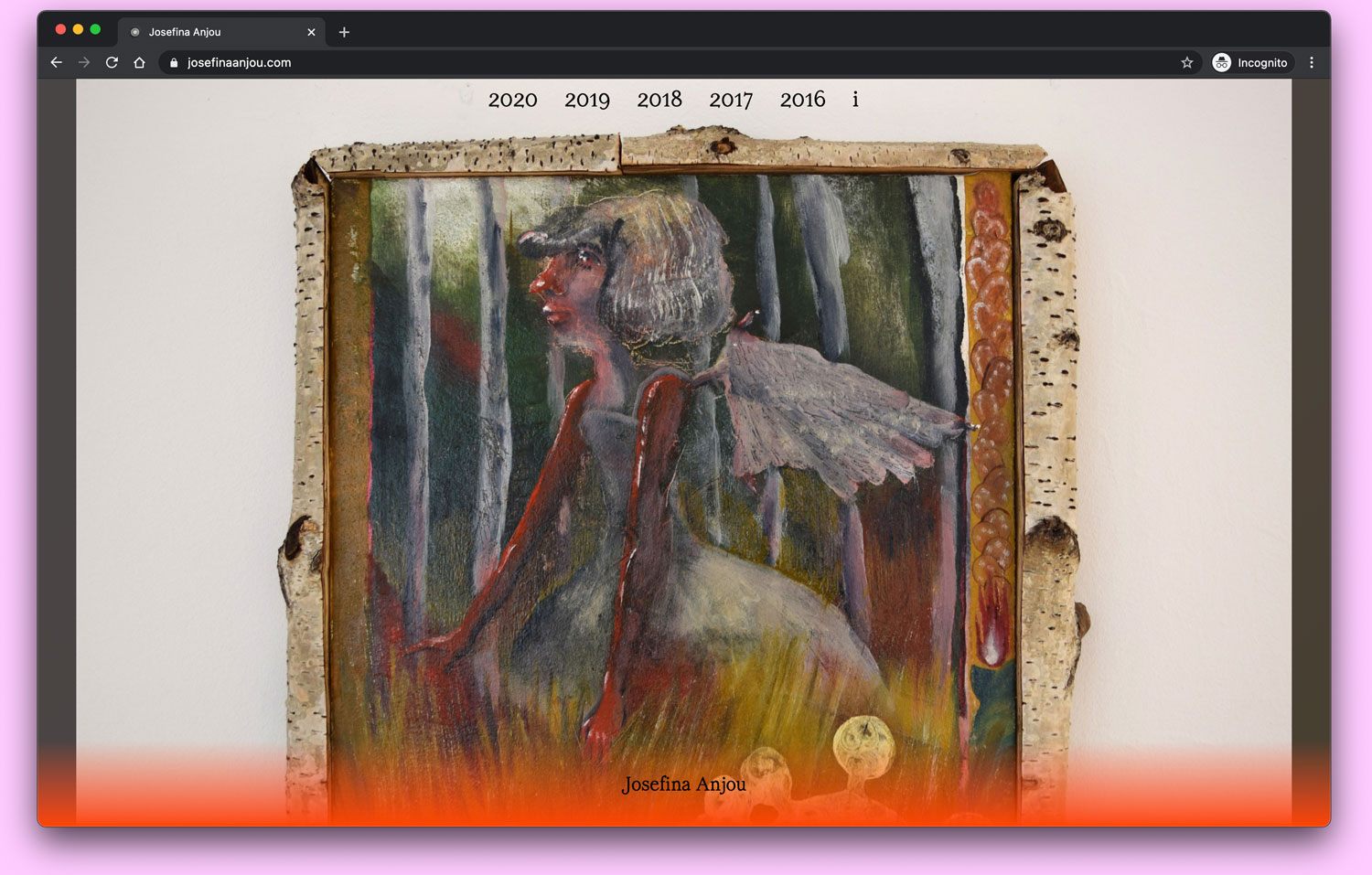
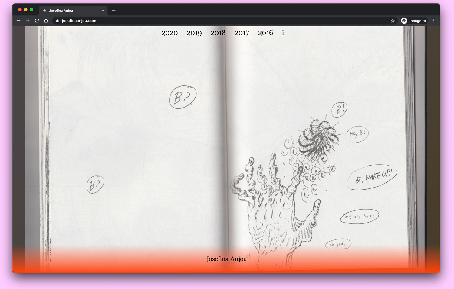
Website—Josefina Anjou, Jan. 2021
Design and programming of website for artist Josefina Anjou. WL typeface Menopause in use for years, name, and links.
Image JA.1
Image JA.2
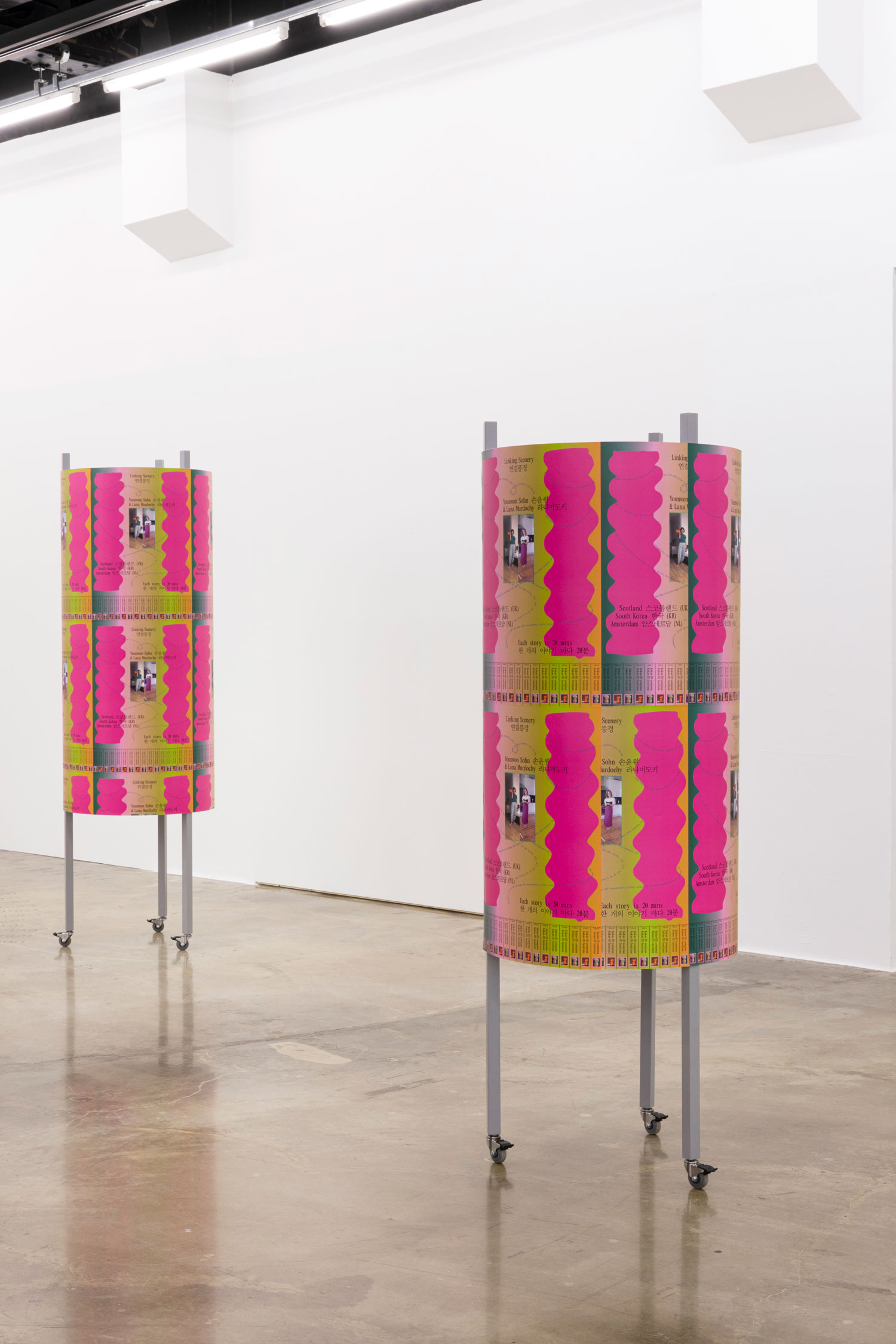
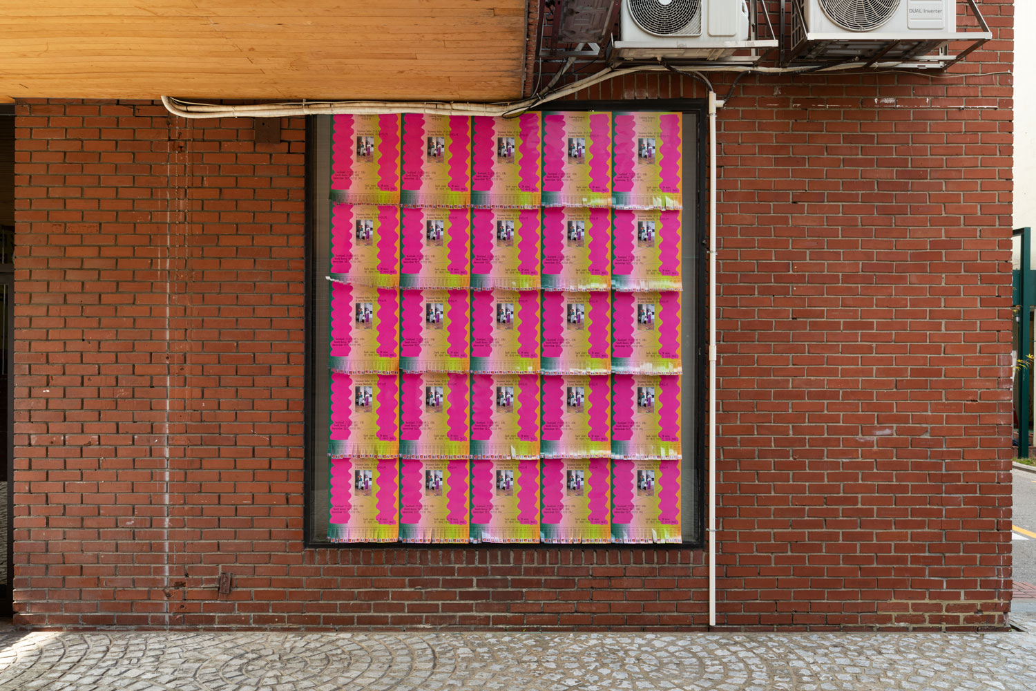
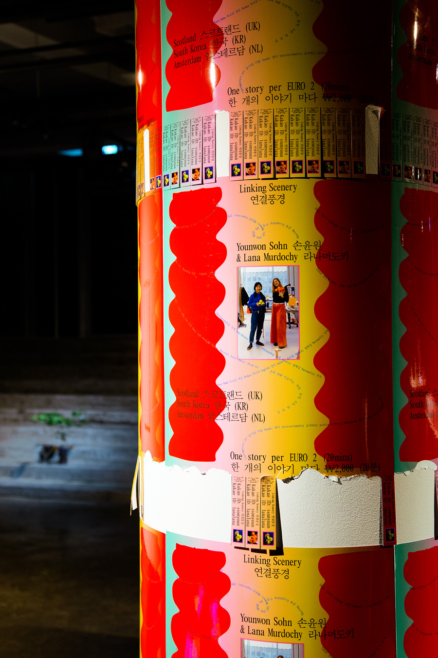
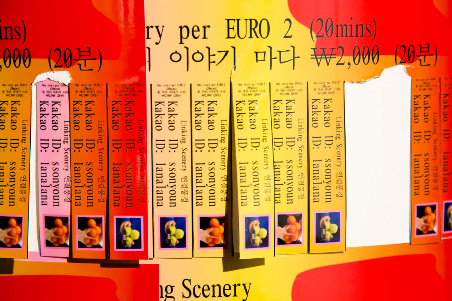
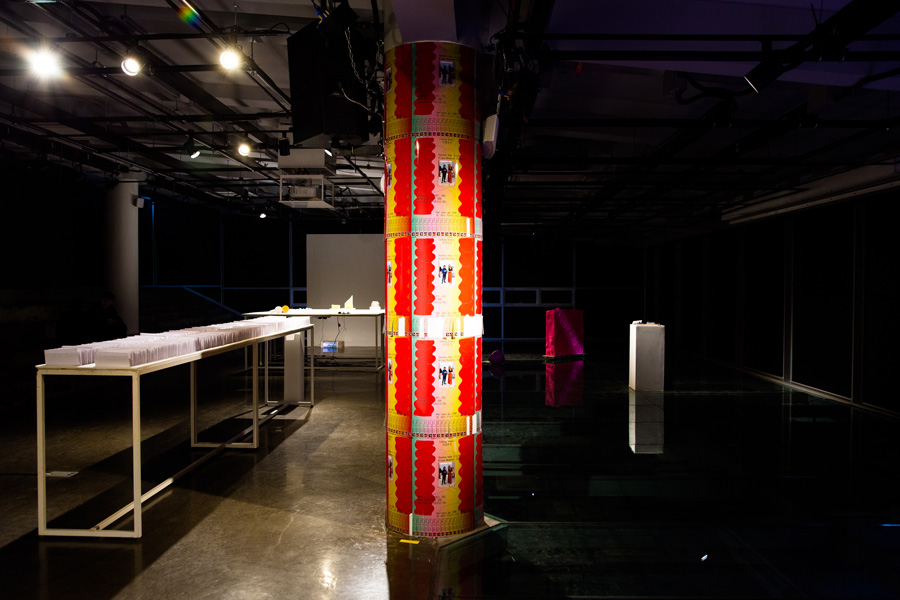
Poster Design—Younwon Sohn and Lana Murdochy, Jul. 2020
Second edition of tear-off poster for Linking Scenery, a sound piece and intimate conversation between the two artists.
Image LS2.1
Image LS2.2
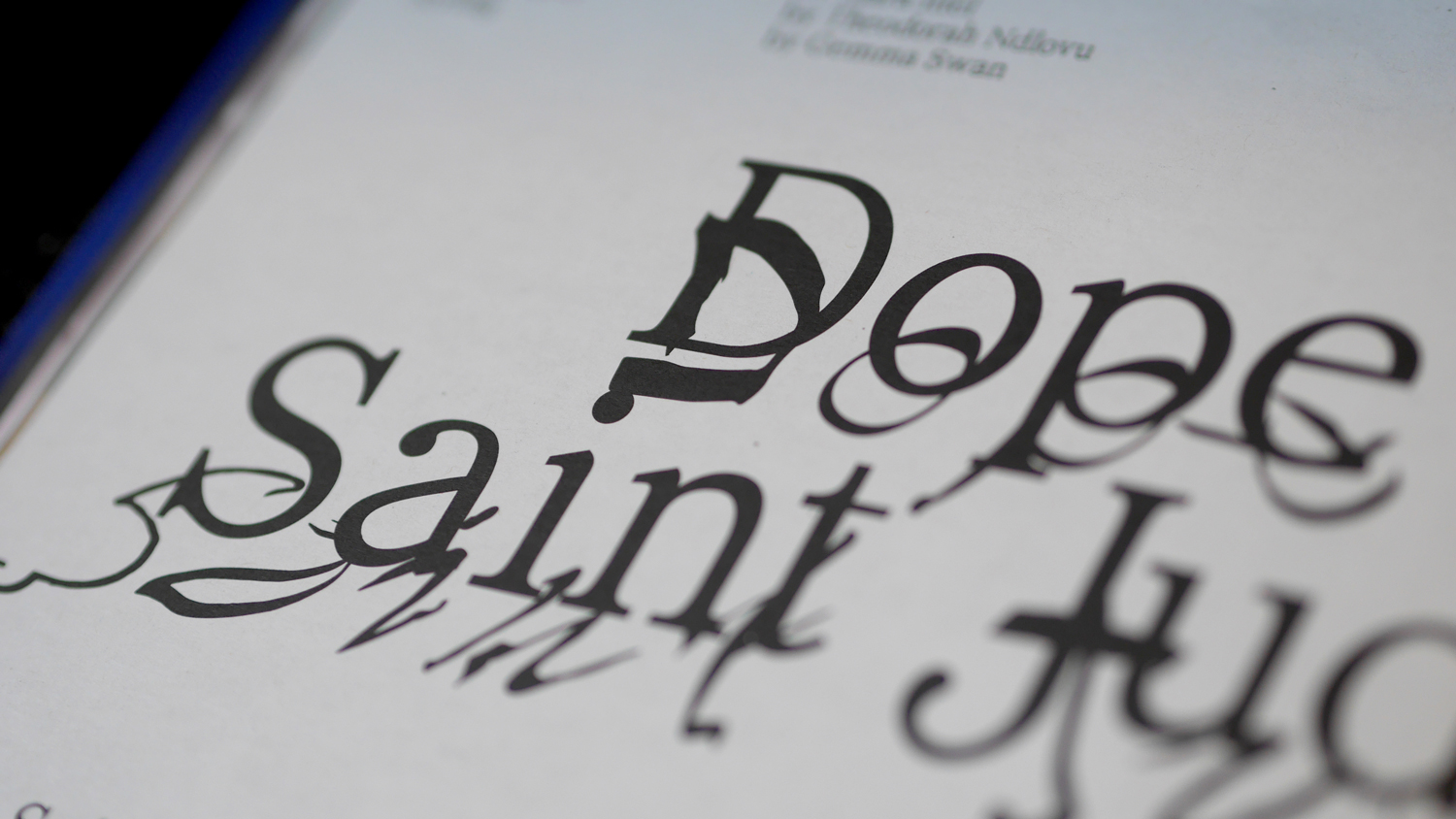
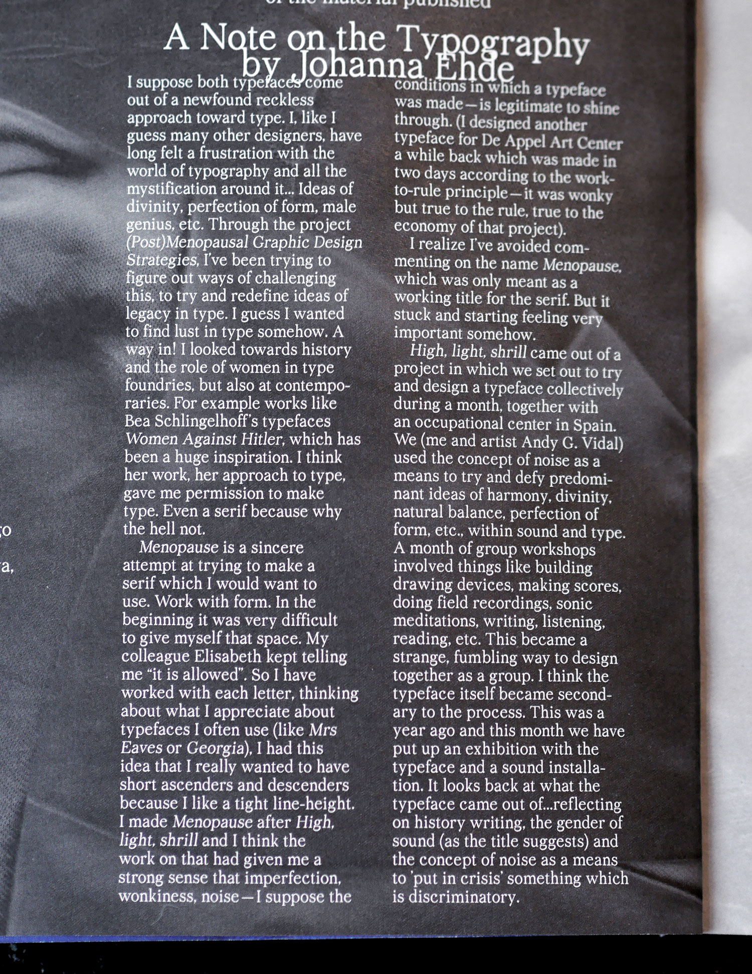
Typefaces and type text—Girls Like Us #12, Jan. 2020
WL typefaces High, light, shrill and Menopause are in use throughout the 12th issue of Girls Like Us Magazine which is designed by Sara Kaaman. Also, a note on the two typefaces, set in Menopause.
Image GLU.1
Image GLU.2
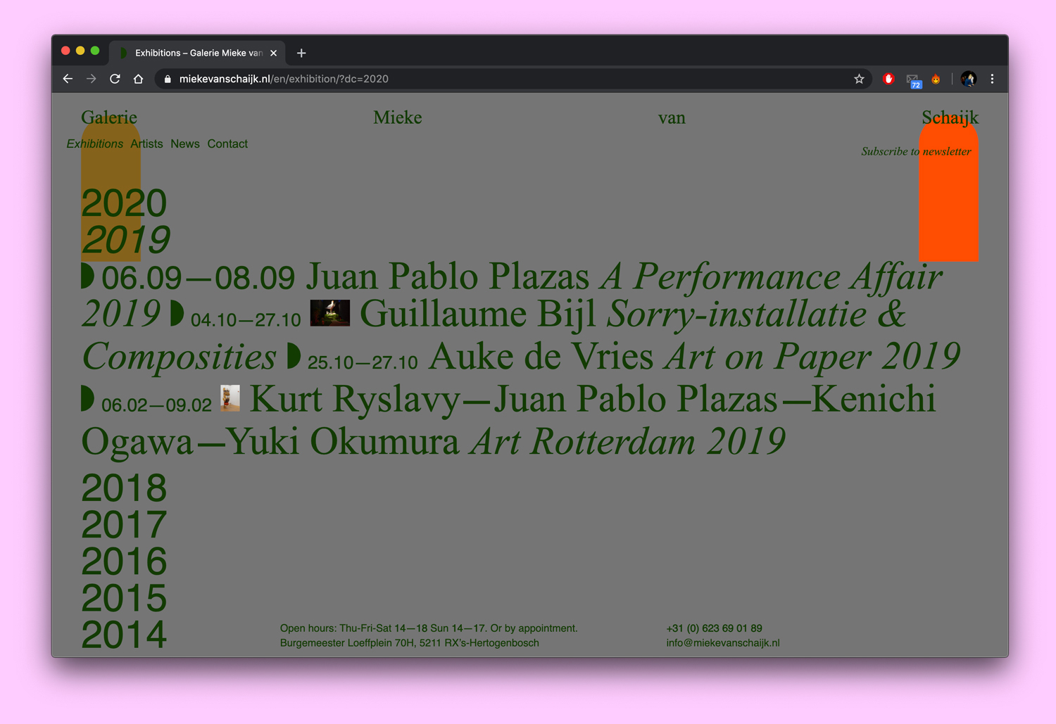
Website—Galerie Mieke van Schaijk, Dec. 2019
Design of visual identity and website for Galerie Mieke van Schaijk.
Image GMVS.1
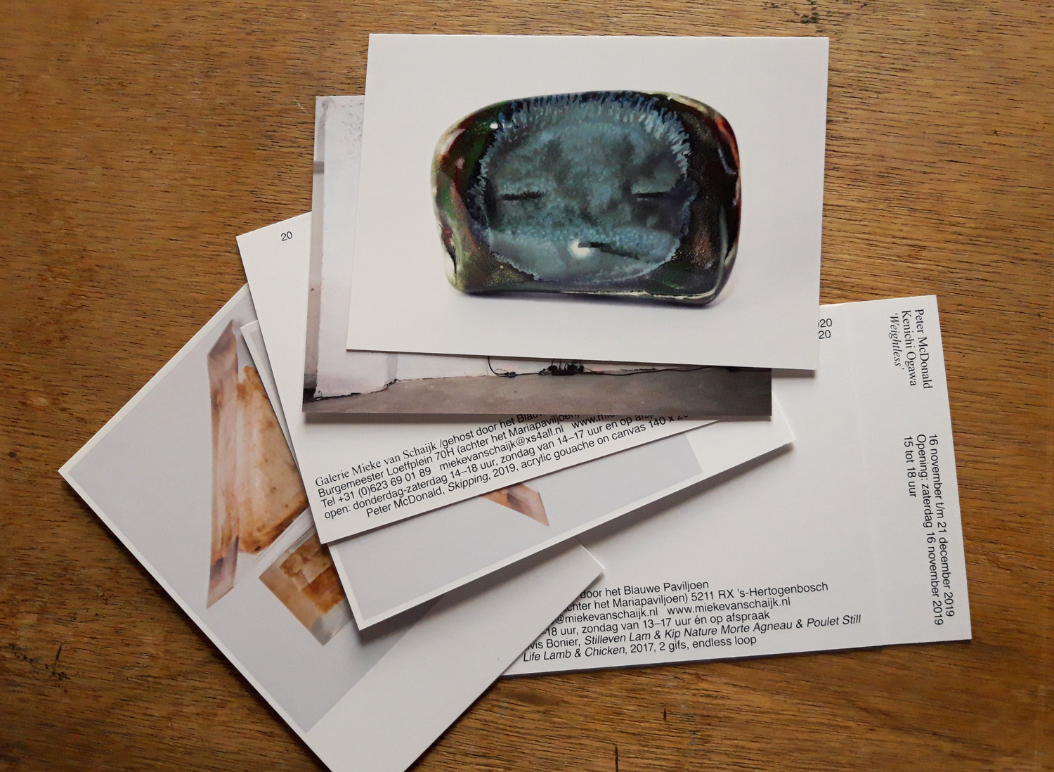
Postcards—Galerie Mieke van Schaijk, Dec. 2019
Ongoing postcard design for each exhibition at Galerie Mieke van Schaijk.
Image PG.1
Exhibition—Aguda, ligera, estridente, Nov. 2019
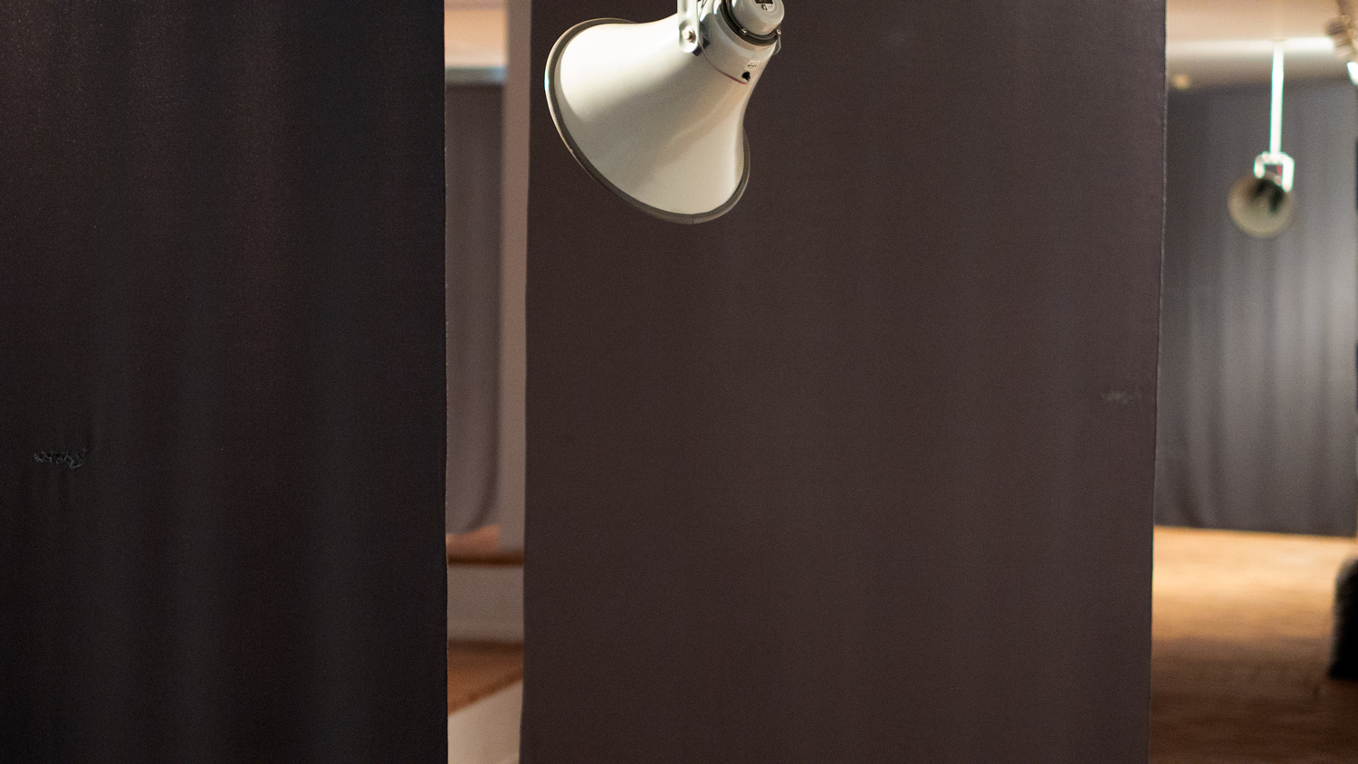
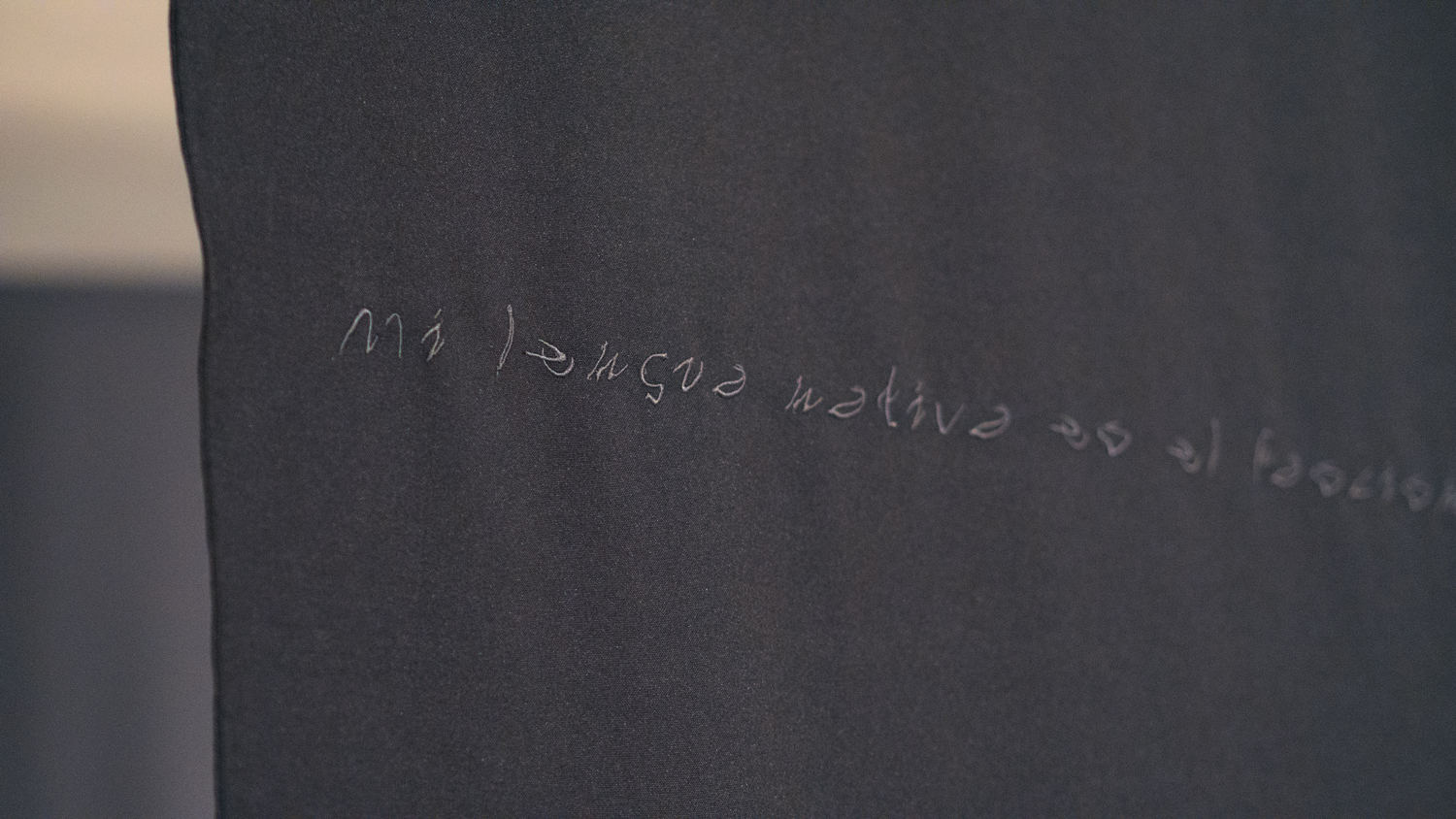
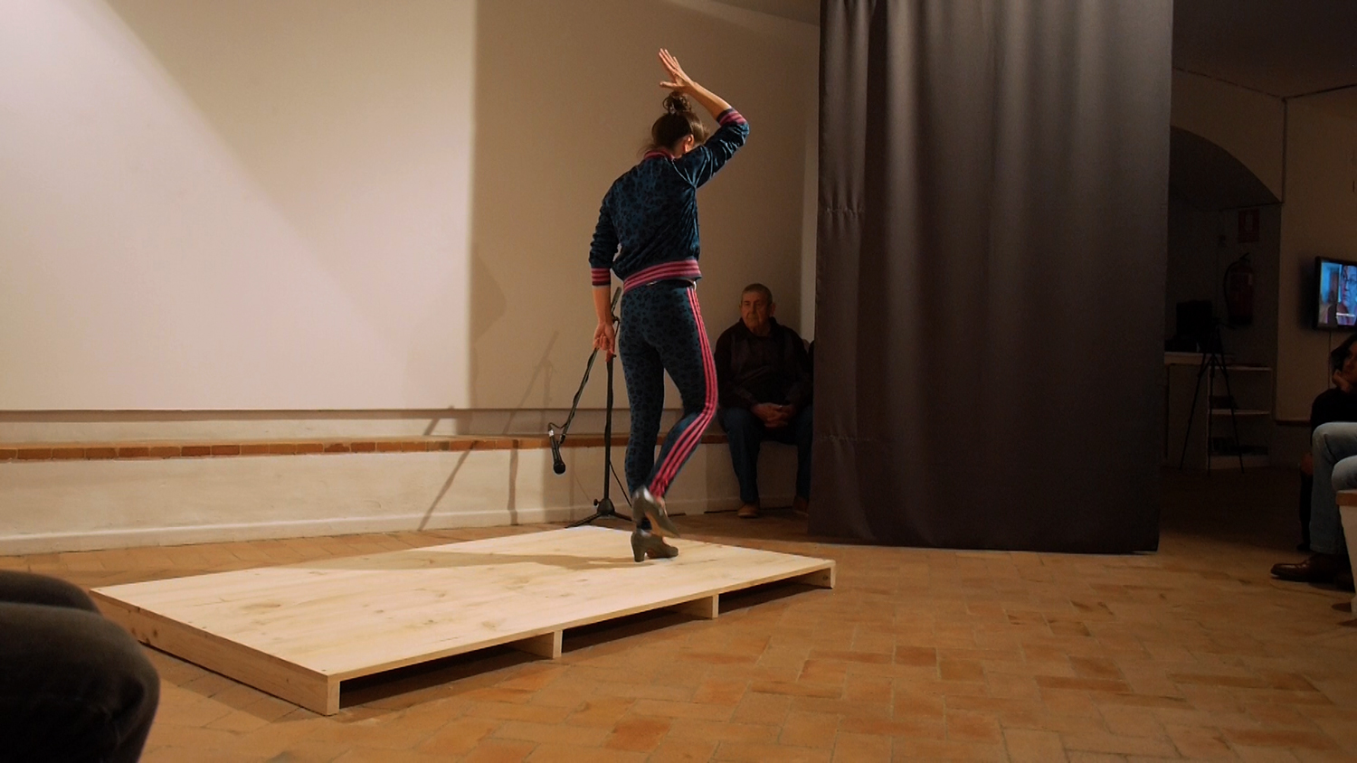
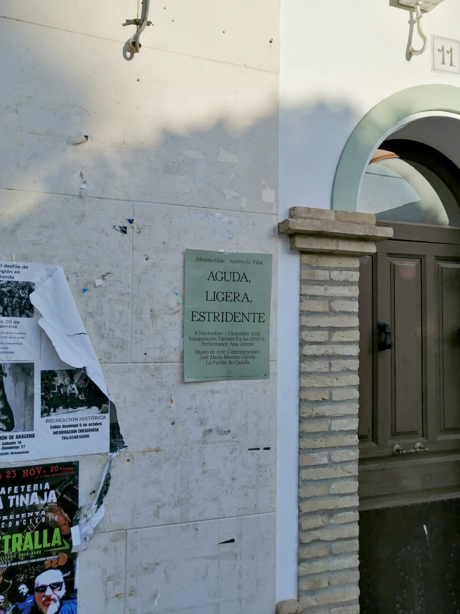
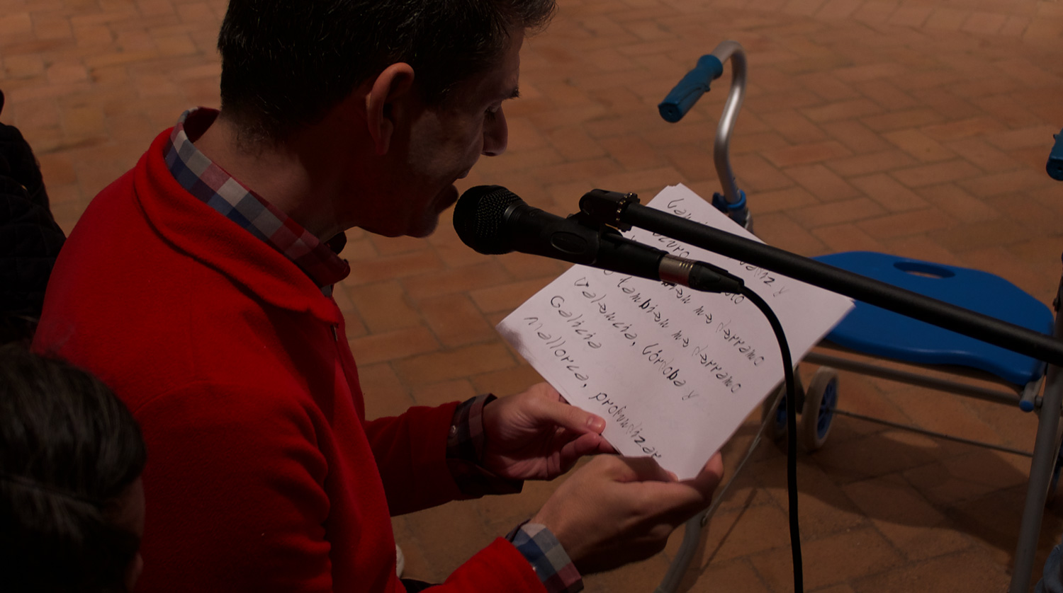
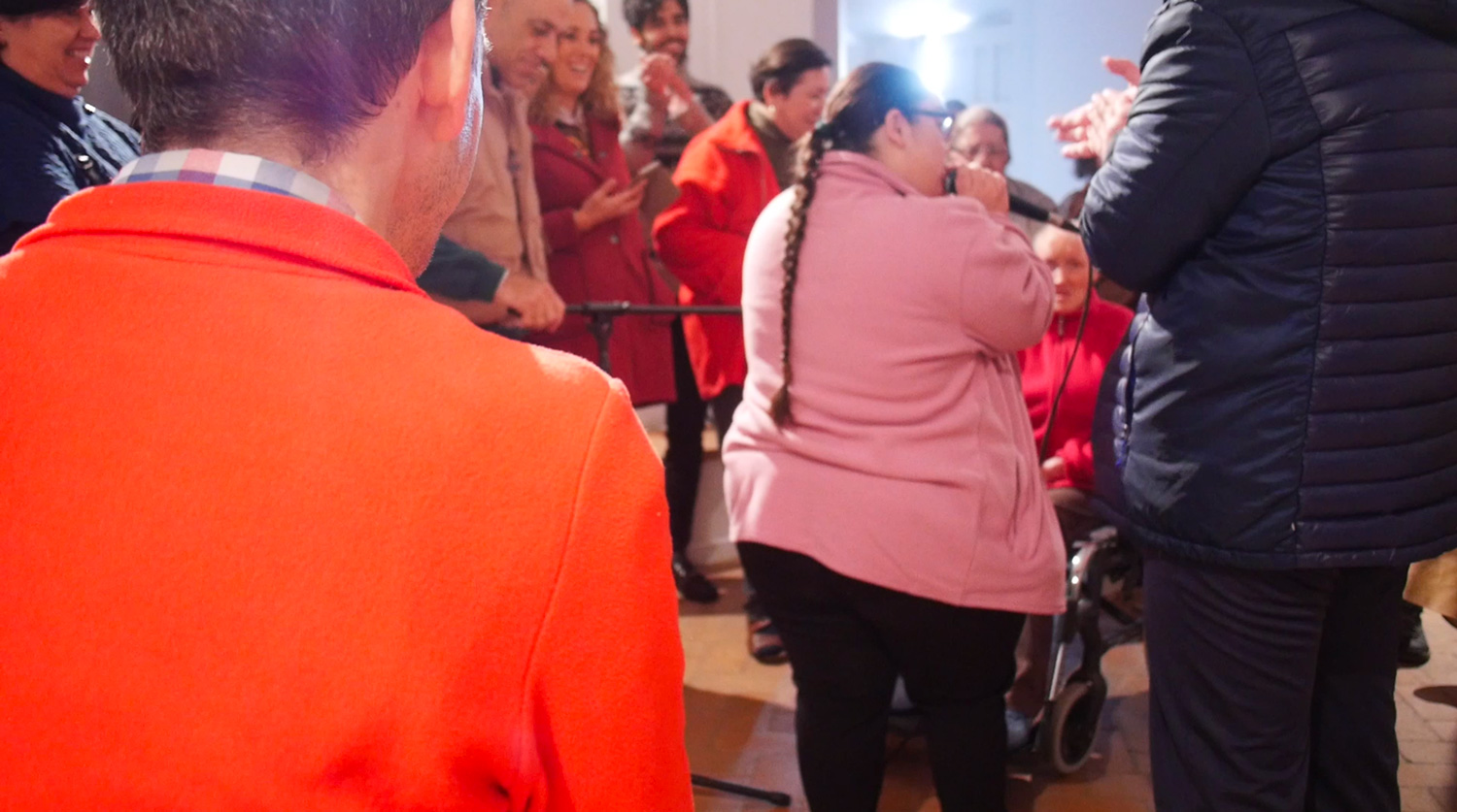
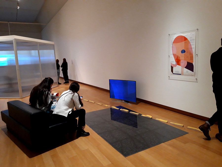
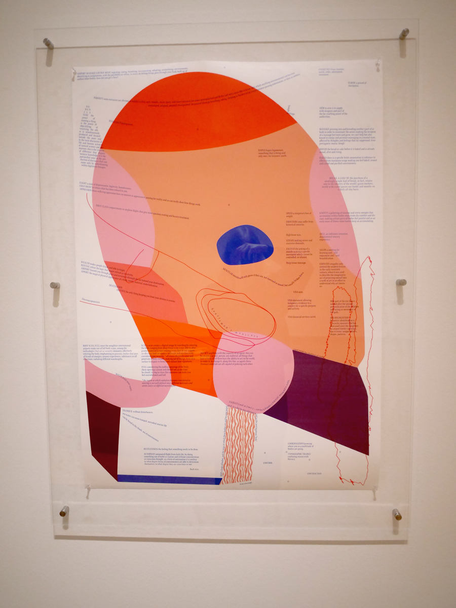
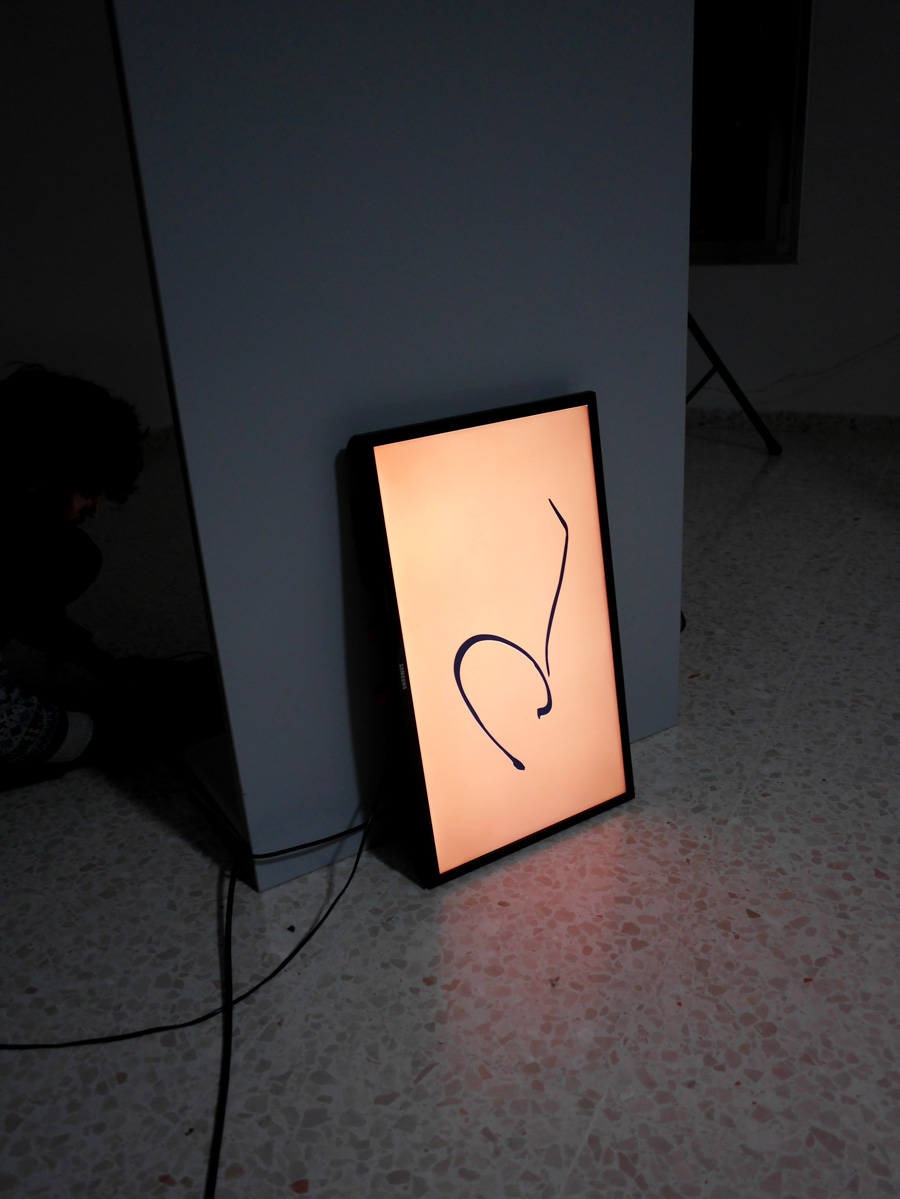
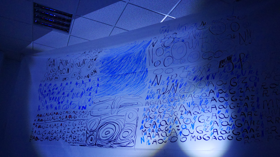
Aguda, ligera, estridente with Andy G. Vidal at Museo De Arte Contemporáneo José María Moreno Galván in La Puebla de Cazalla, Seville. Opening performance by Ana Arenas. Aguda, ligera, estridente is the continuation of Collective Type and Noise Design. It tries to capture the voice of a typeface which was developed through “noisy” means. Its sound is built in close relationship to cultural constructions on gender and sound. Words were generously lent to the piece by Galician writer, poet and political activist Chus Pato.
Image ALE.1
Image ALE.2
Image ALE.3
Image ALE.4
Image ALE.5
Image ALE.6
Video and typeface—Cry Till I Die, Oct. 2019
15 minute video piece as part of (P)MGDS.
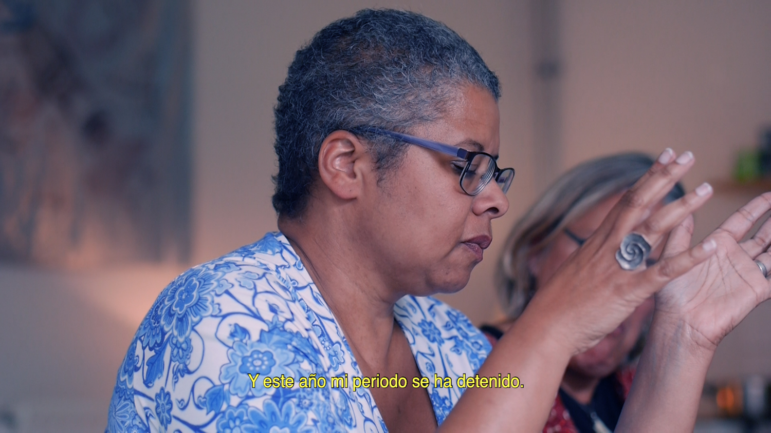
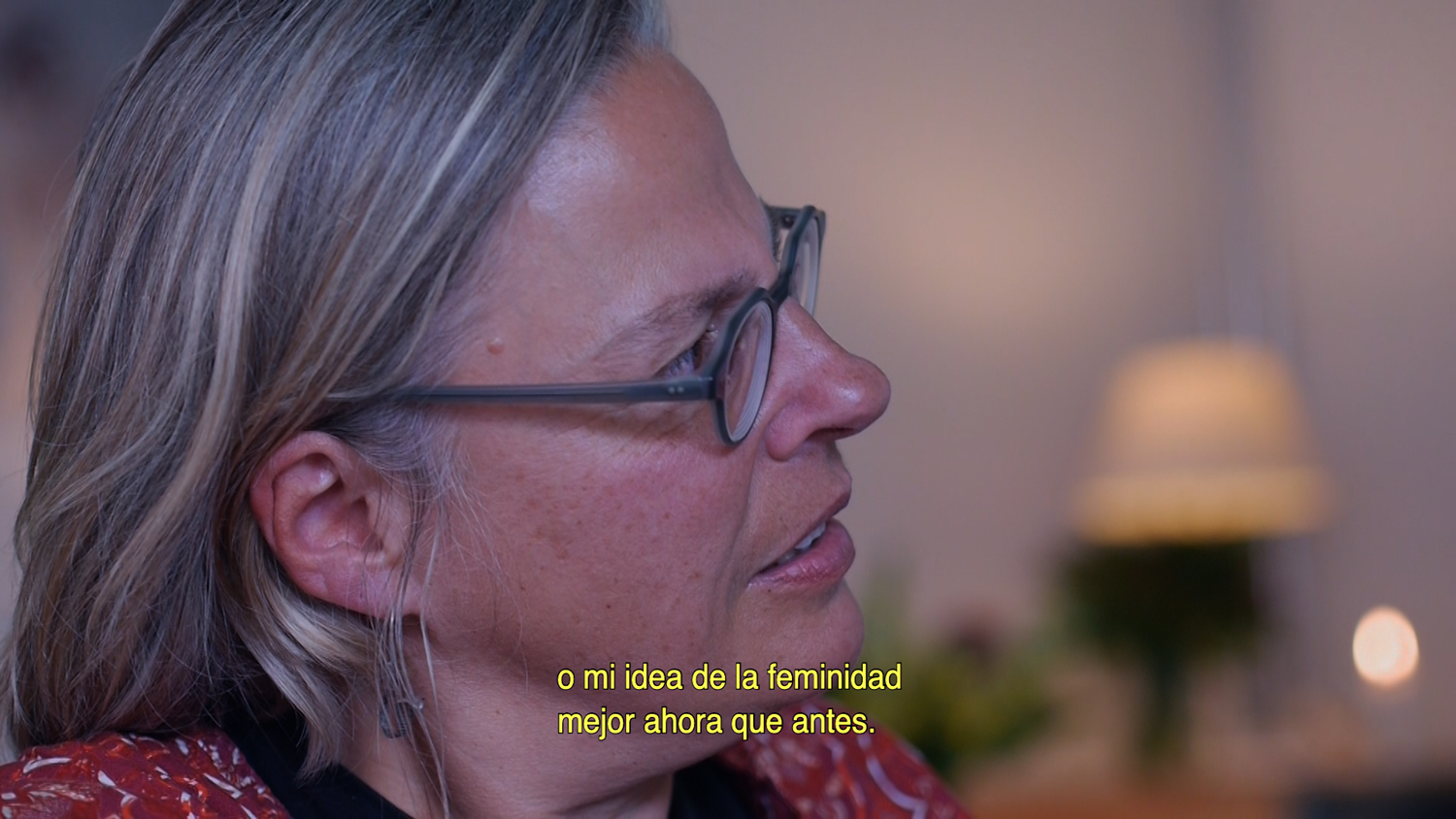
The video is the documentation of a dinner conversation on the theme of menopause and work. Chapter titles set in the (P)MGDS typeface.
Image CTID.1
Image CTID.2
Image CTID.3
Group exhibition—Ornamental rest, Oct. 2019
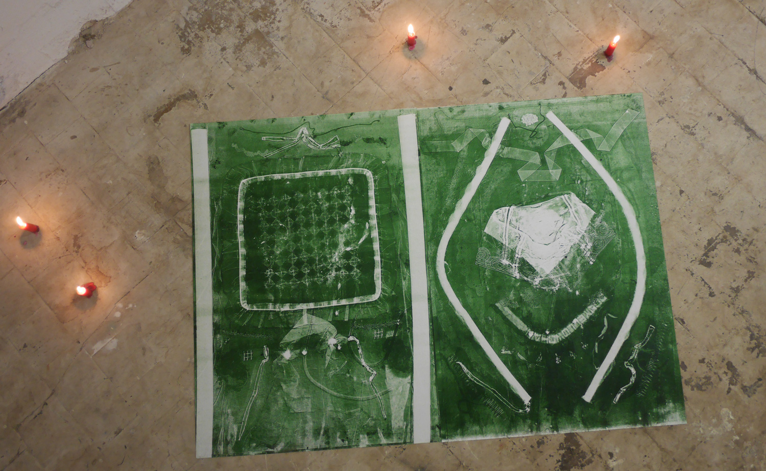
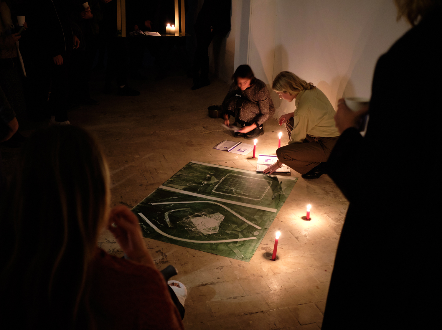
Following the publishing of MsHeresies #2 Useful Work versus Useless Toil, Ornamental Rest was initiated at Laurel Project Space, Amsterdam. With works and collectively made prints by Juliet Aaltonen, Elina Birkehag, Klara Graah, Rosita Kær, Asefeh Tayebani, and Rietlanden Women’s Office. Reading from MsHeresies #1 and MsHeresies #2 by Rietlanden Women’s Office.
Image OR.1
Image OR.2
Image OR.3
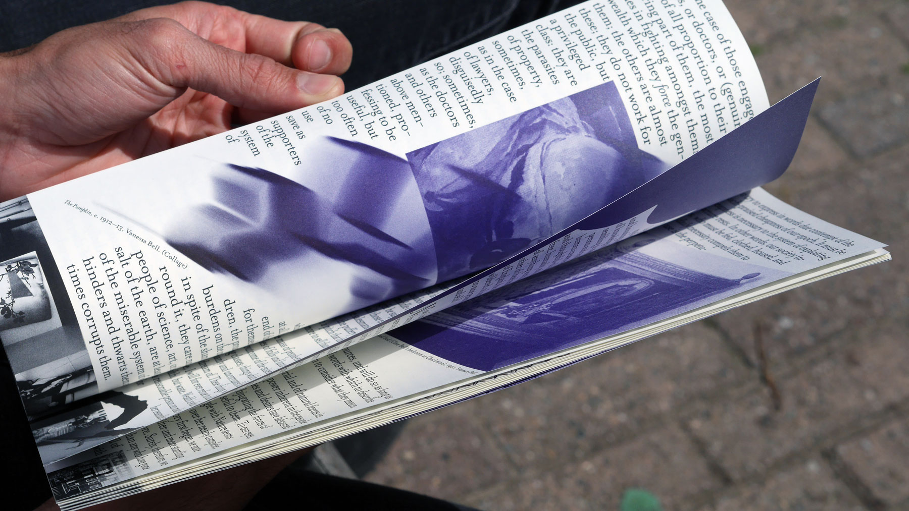
Publication—MsHeresies #2, Aug. 2019
The second issue of MsHeresies, Useful Work Versus Useless Toil, with Elisabeth Rafstedt. More about the project in this Walker Art Center article. The issue will be available in some book shops, libraries, galleries and on the Rietlanden Women's Office Website.
“The most radical thing to do would be to stop. To collectively stop toiling and consuming, and just rest. We need a good Animal Rest. This is rest in abundance and completely free from anxiety. It can not be achieved on an individual level, it is not a private matter of self-help, wellness, and mindfulness – that’s toiling too. It is the rest that the “beast-like pain”, inherent in all work demands! It’s a collective, radical rest.”—RWO.
Image M.1
Image M.2
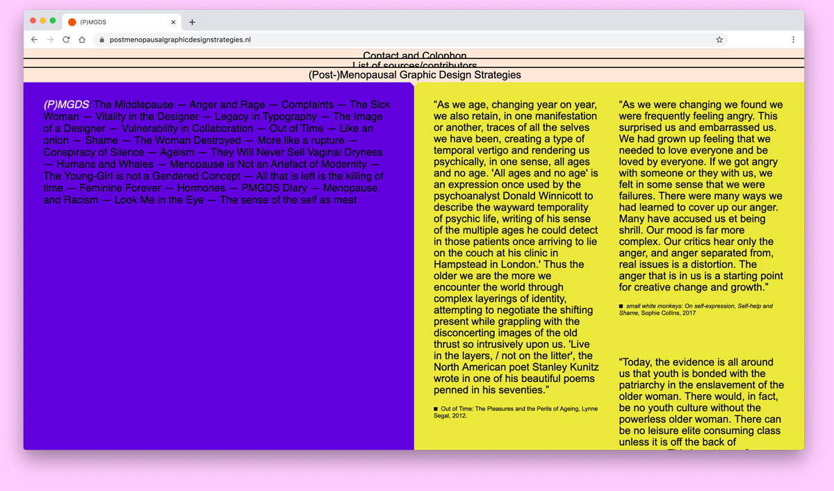
Website—(Post)Menopausal Graphic Design Strategies, Jul. 2019
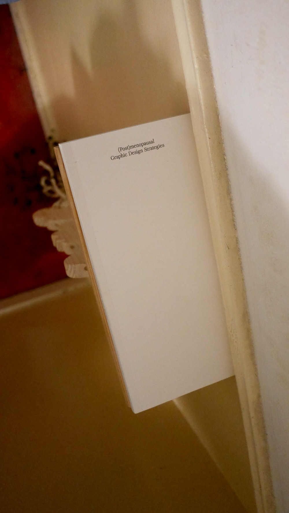
Online archive of (Post)Menopausal Graphic Design Strategies. The project's main objective is to gain practical knowledge into how to develop and maintain a life-long graphic design practice while considering the issues of sexist ageism, and women’s health. Programmed by Fallon Does.
Image PMGDSW.1
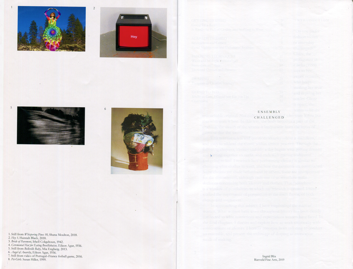
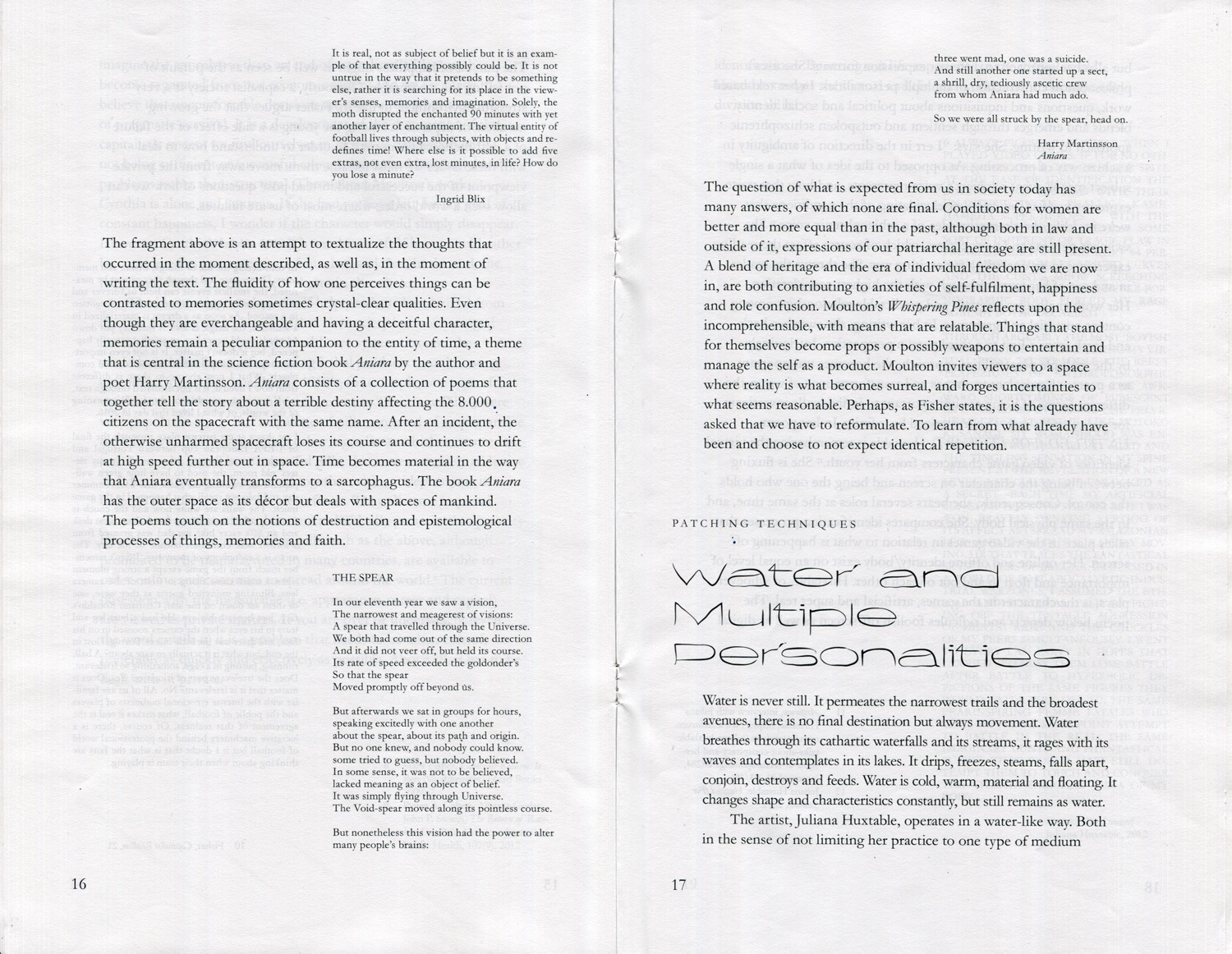
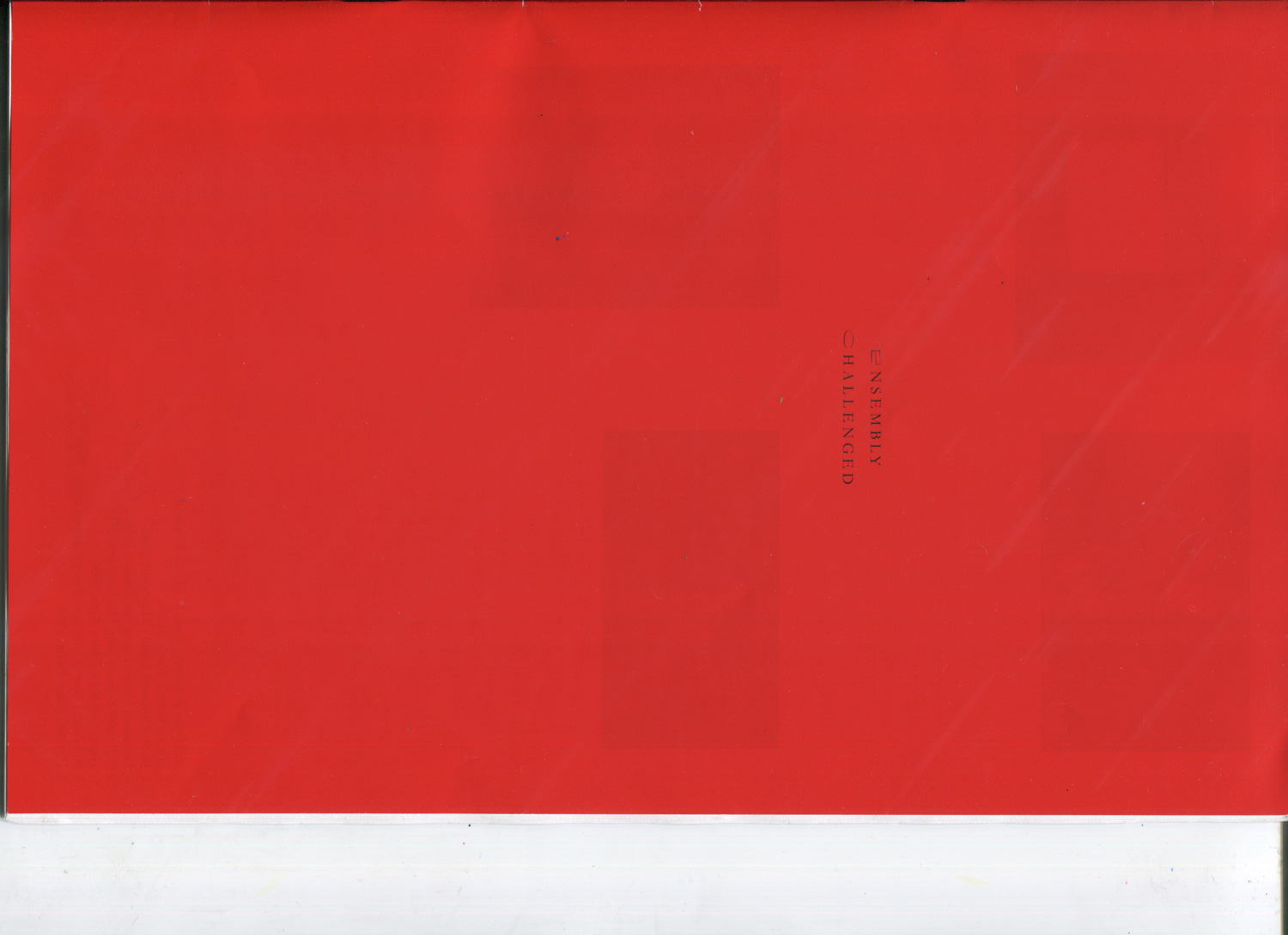
Publication—Ensembly Challenged, Jul. 2019
Thesis design for and with artist Ingrid Blix. The title typeface is Flat Earth.
Image EC.1
Image EC.2
Image EC.3
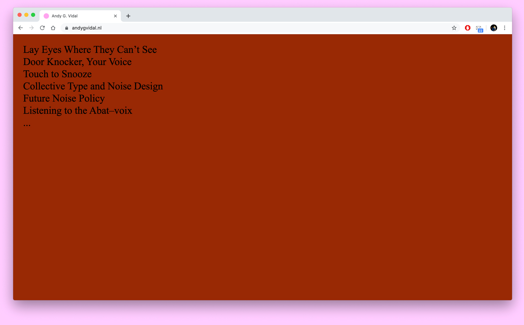
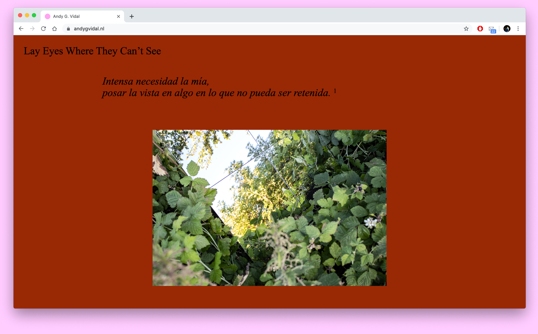
Artist website—brownish red, Jun. 2019
Website for artist Andy G. Vidal.
Image AVW.1
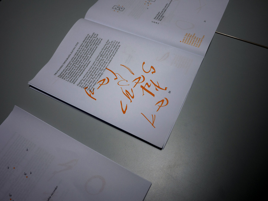
Typeface and book—(P)MGDS, May. 2019
Part of the group show Torpor / A Bliss / A Slump. The book gathers texts and notes from (Post)Menopausal Graphic Design Strategies.
Image TAA.1
Image TAA.3
Artist book—The Landscape Crossing an Ocean, Apr. 2019
Shown as part of Mayra Sergio's work The Landscape Crossing An Ocean, at ISO, Amsterdam. The book served as an index over the exhibition objects in scale 1:1.
Image TLCAO.1
Image TLCAO.2
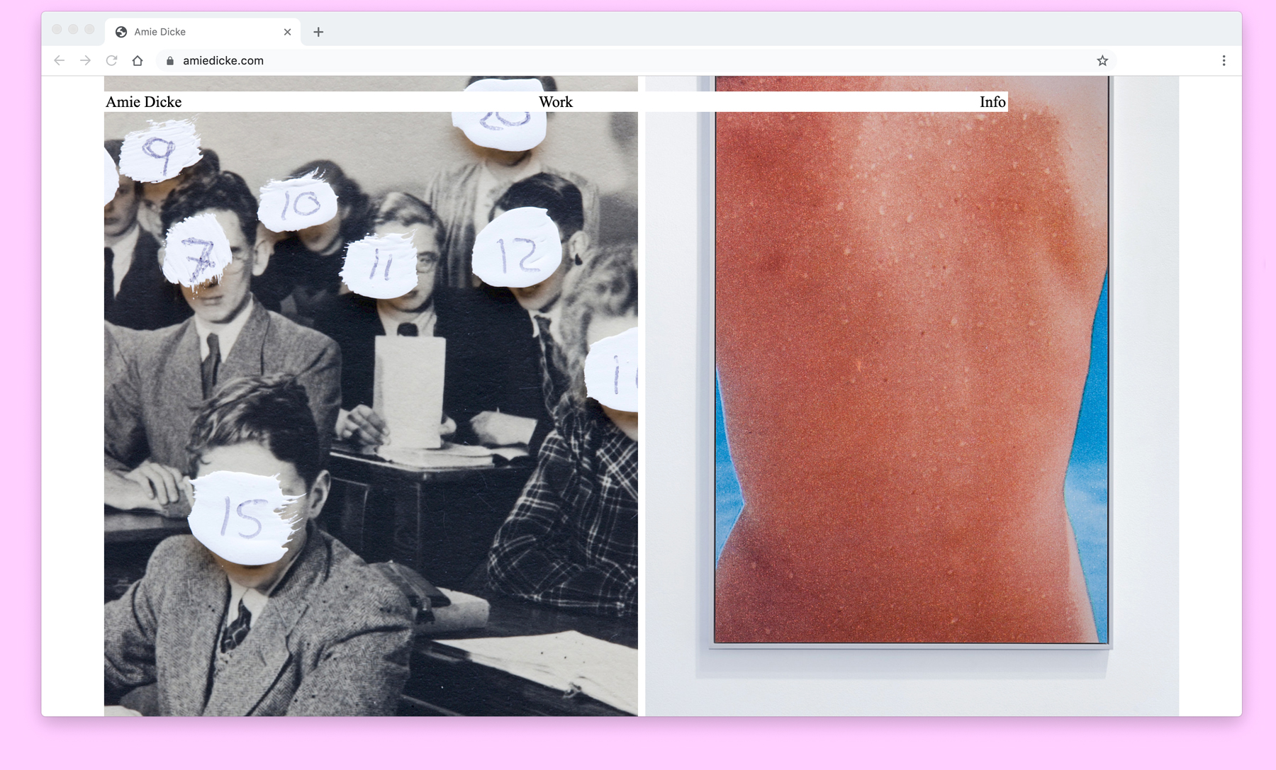
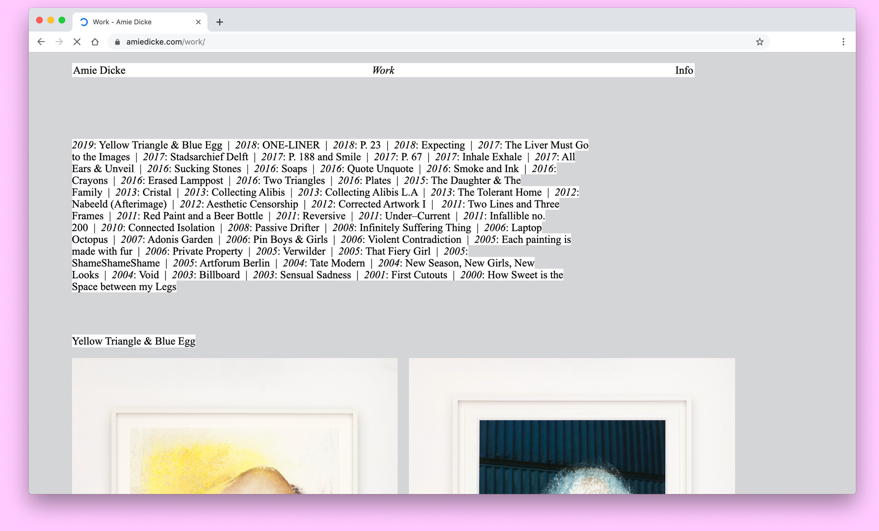
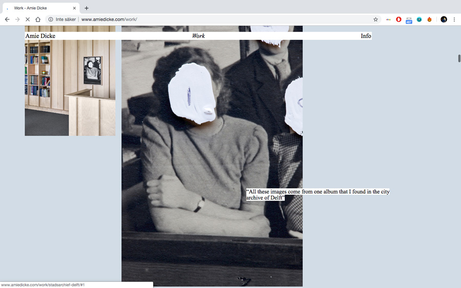
Artist website—Amie Dicke, Apr. 2019
Website for Amsterdam based artist Amie Dicke.
Image ADW.1
Image ADW.2
Poster Design—Younwon Sohn and Lana Murdochy, Mar. 2019
Tear-off poster for Linking Scenery, a sound piece and intimate conversation between the two artists and a translator on a number of topics, part of the group show DEGITAL – in your hands 전시 소개, Seoul.
Image LS.1
Image LS.2
Image LS.3
Design for Jort van der Laan at Stedelijk, Nov. 2018
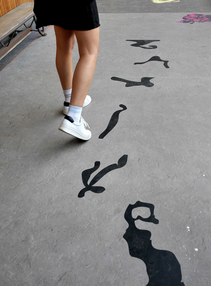
Poster and carpet design for Jort van der Laan’s work Neither of us is Powerless, part of the Freedom of Movement exhibition at Stedelijk, Amsterdam.
Image NUP.1
Image NUP.2
Image NUP.3
Image NUP.4
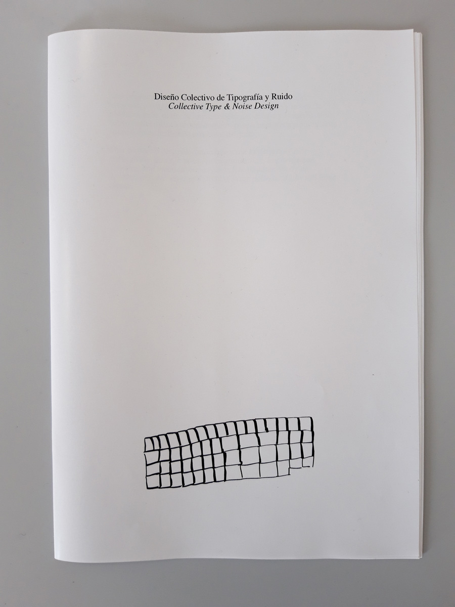
Collective Type and Noise Design, Nov. 2018
An exploration into ways of designing type collectively, through voice, noise production, improvisation and drawing exercises (simultaneously an exploration into ways of designing noise collectively by the same means). Developed with artist Andy G. Vidal and a group of enthusiastic locals during a one month residency in Andalusia.
Image CTND.1
Image CTND.2
Image CTND.3
Image CTND.4
Image CTND.5
Image CTND.6
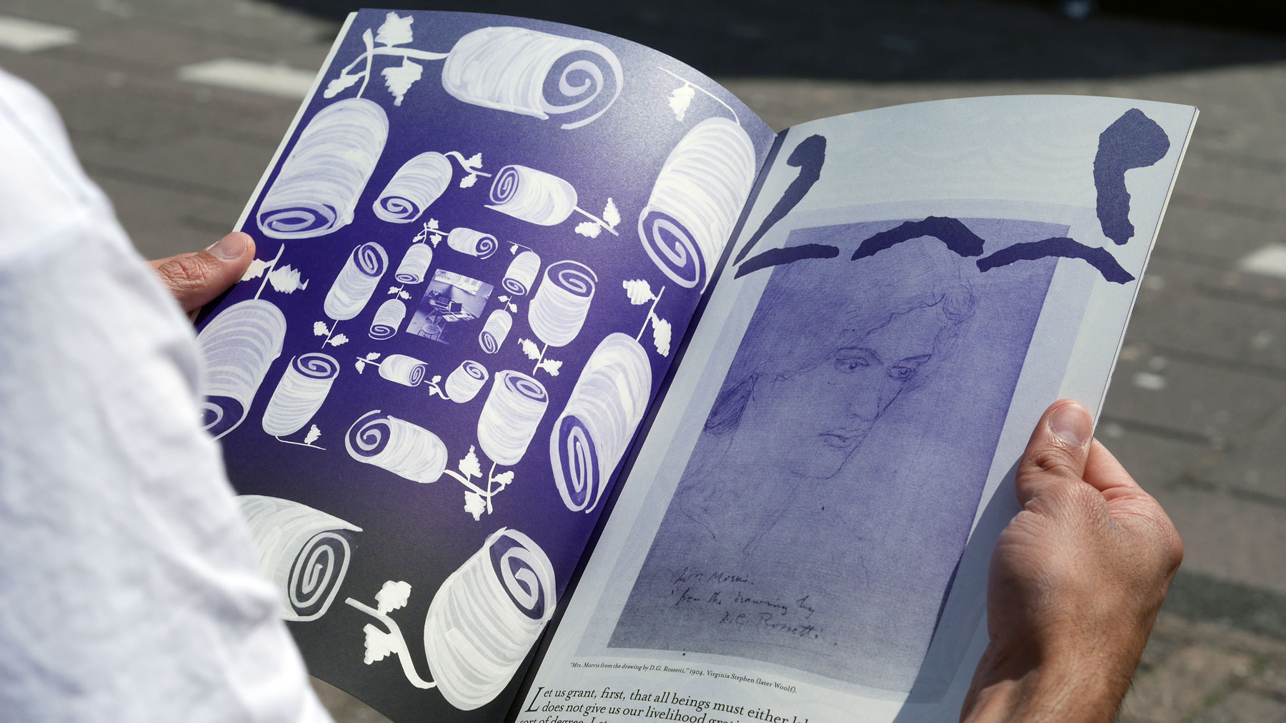
Publication—MsHeresies #1, Jun. 2018
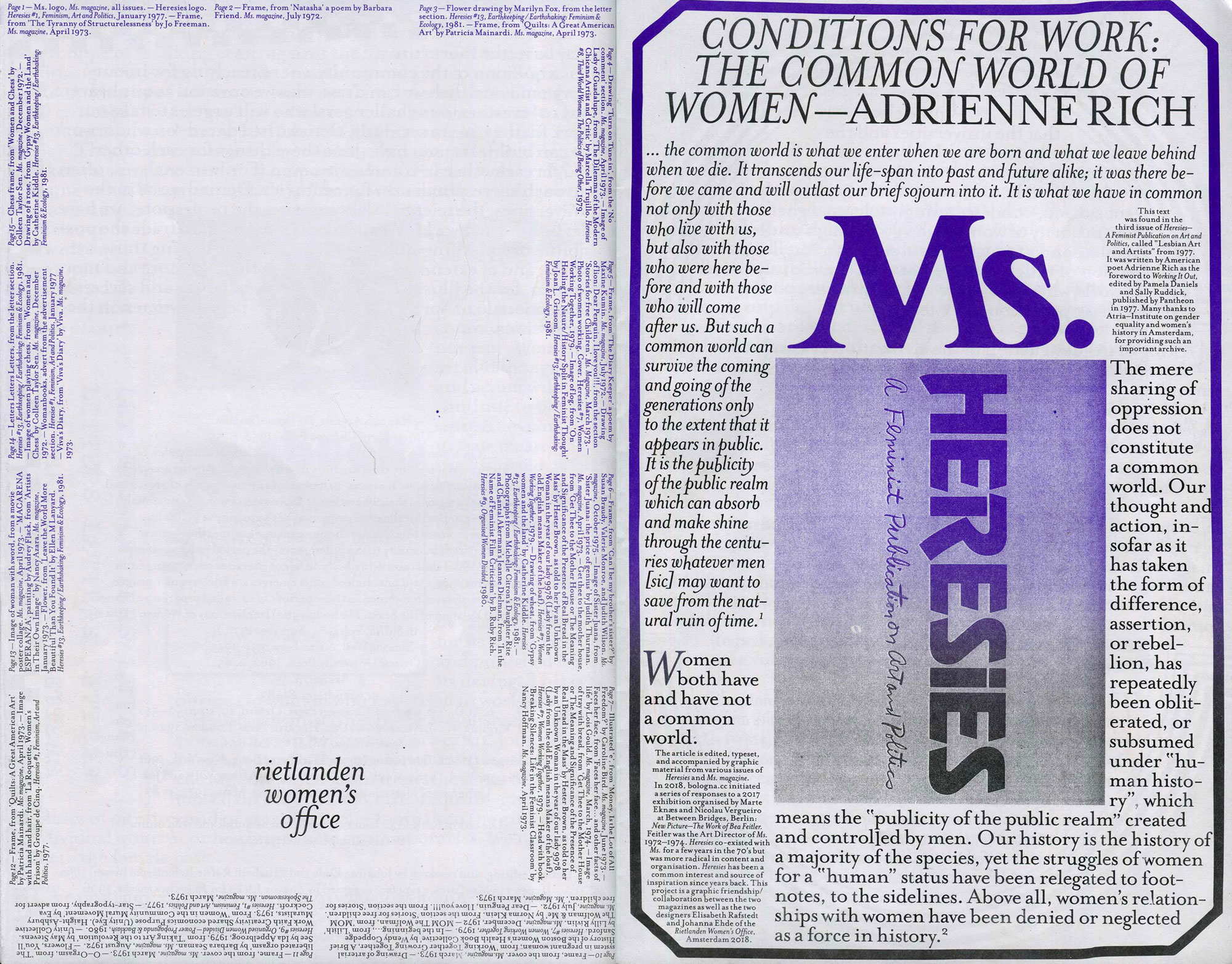
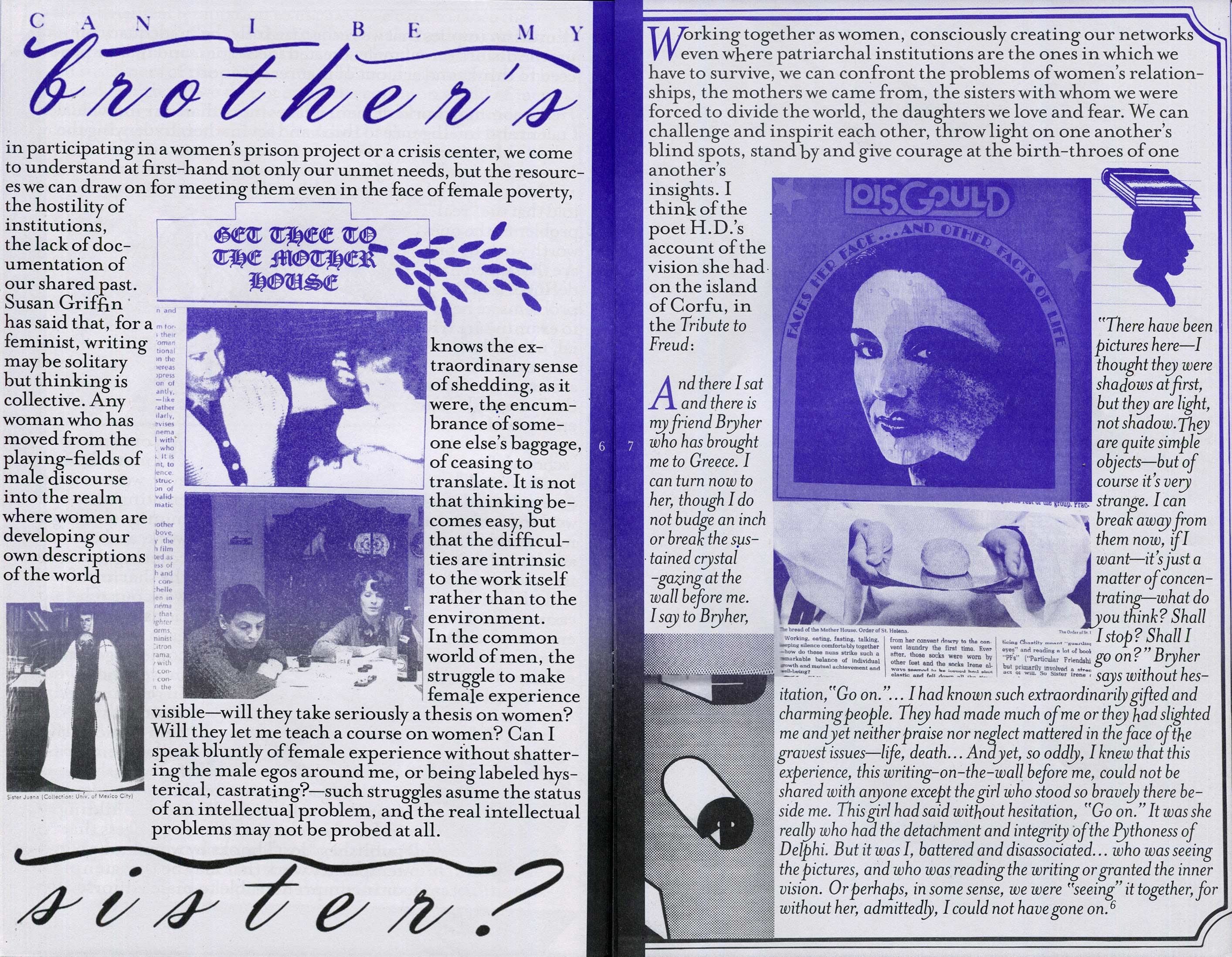
With Elisabeth Rafstedt. The 1977 article Conditions for Work: the Common World of Women by Adrienne Rich is edited, typeset and accompanied by graphic material from various issues of Heresies and Ms. magazine. Heresies has been a common interest and source of inspiration since years back. This project is a graphic friendship/collaboration between the two magazines as well as the two designers. Will be stocked at San Serriffe and De Appel, Amsterdam.
Image MH.1
Image MH.2
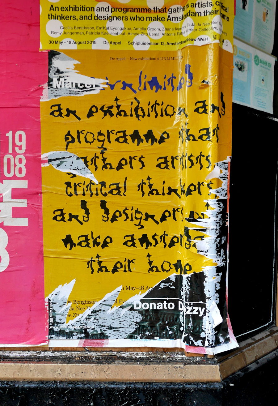
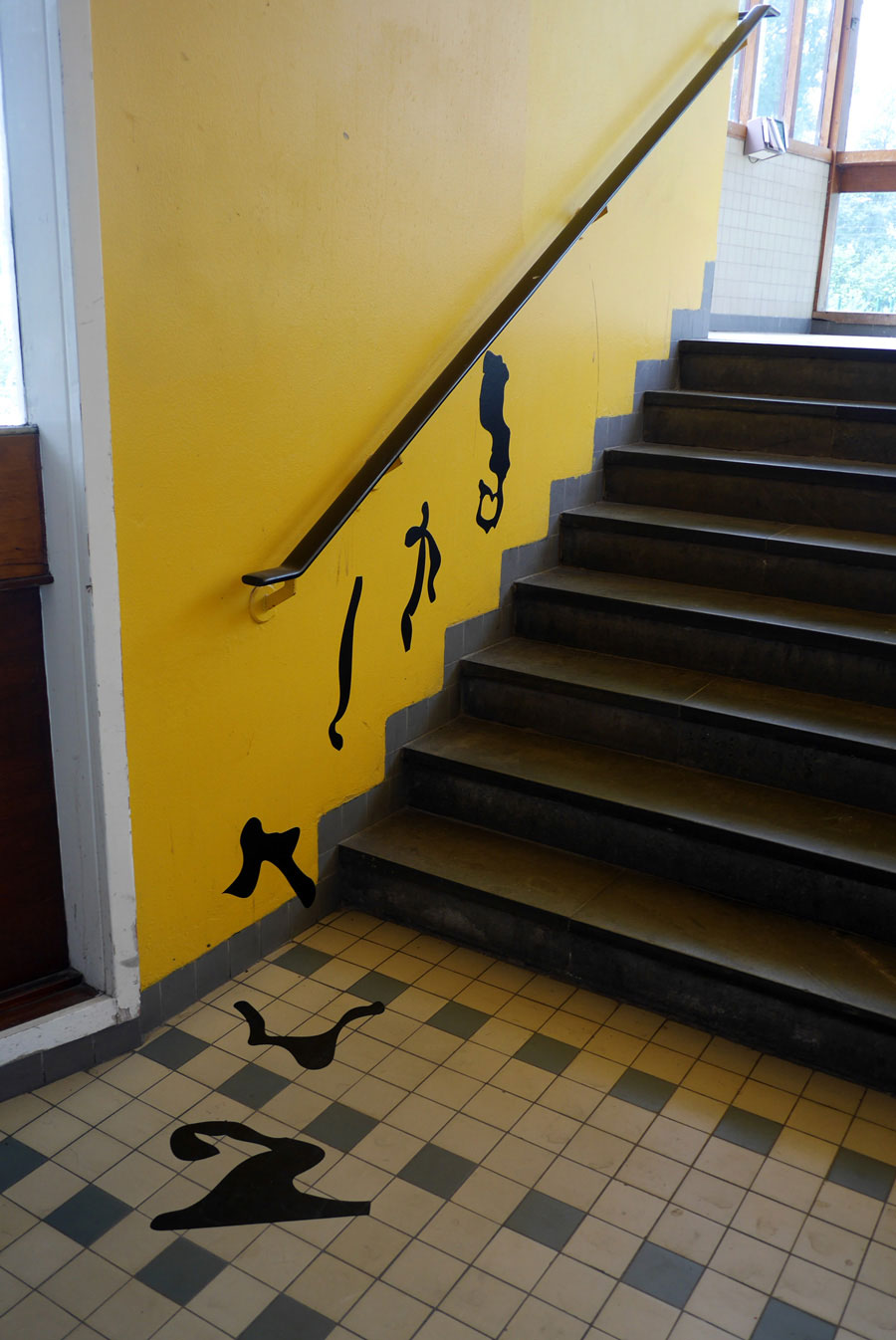
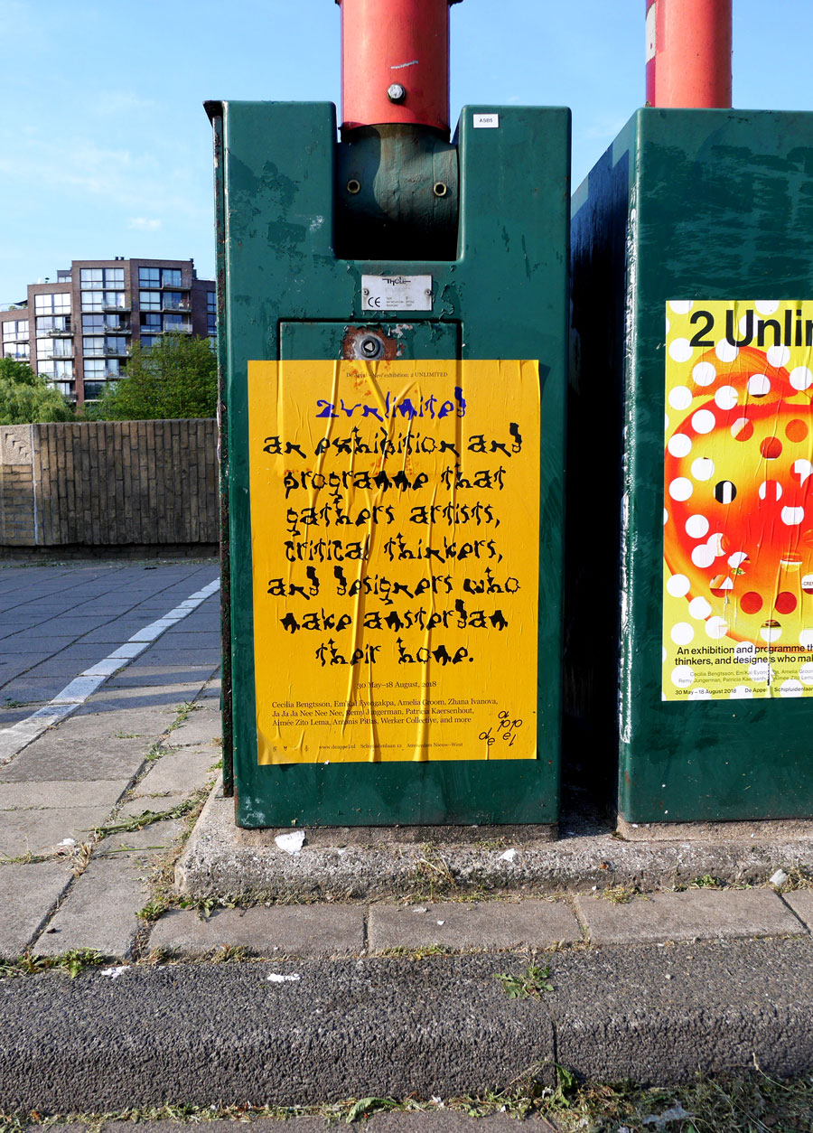
Poster Design and Wayfinding—De Appel’s 2 Unlimited Exhibition, May 2018
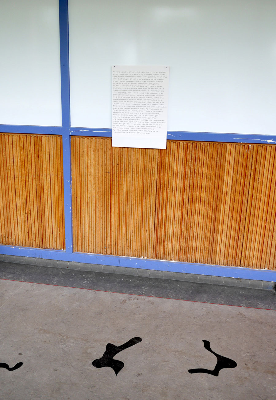
Typeface by Anton Weflö, sourced from trees in Sarphatipark 27–29 March 2018.
Image DP.1
Image DP.2
Image DP.3
Image DP.4
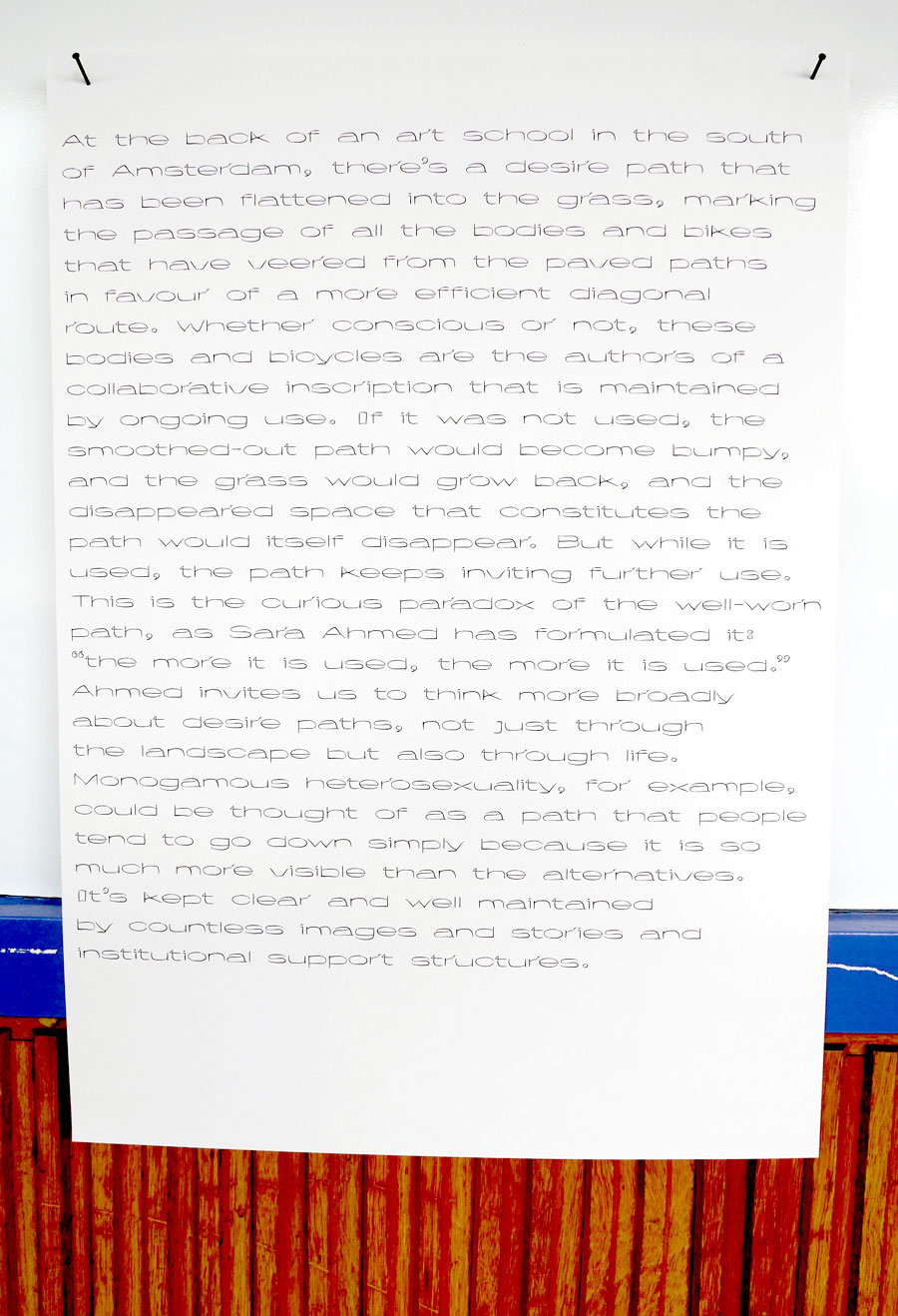
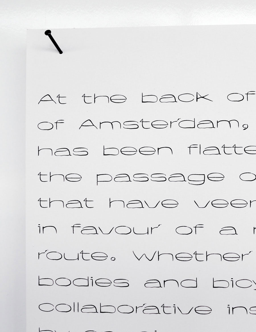
Typeface—Flat Earth for Amelia Groom and De Appel, May 2018
Type design and layout/display for Amelia Groom’s wonderful wall texts at the 2 Unlimited Exhibition.
Image FE.1
Image FE.2
Image FE.3
Annual Report—De Appel 2017, Apr. 2018
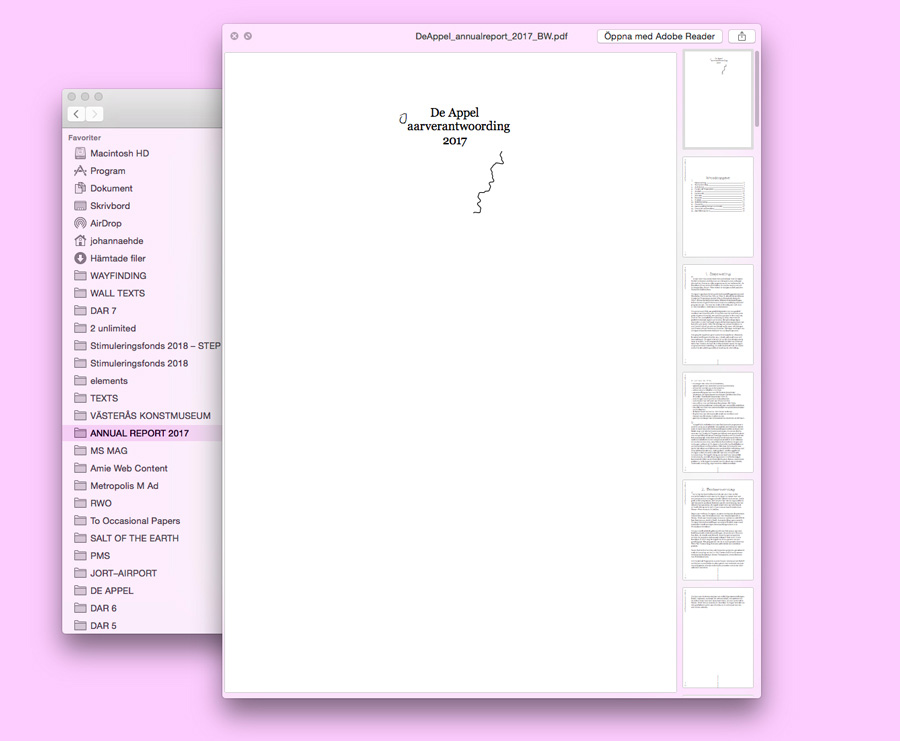
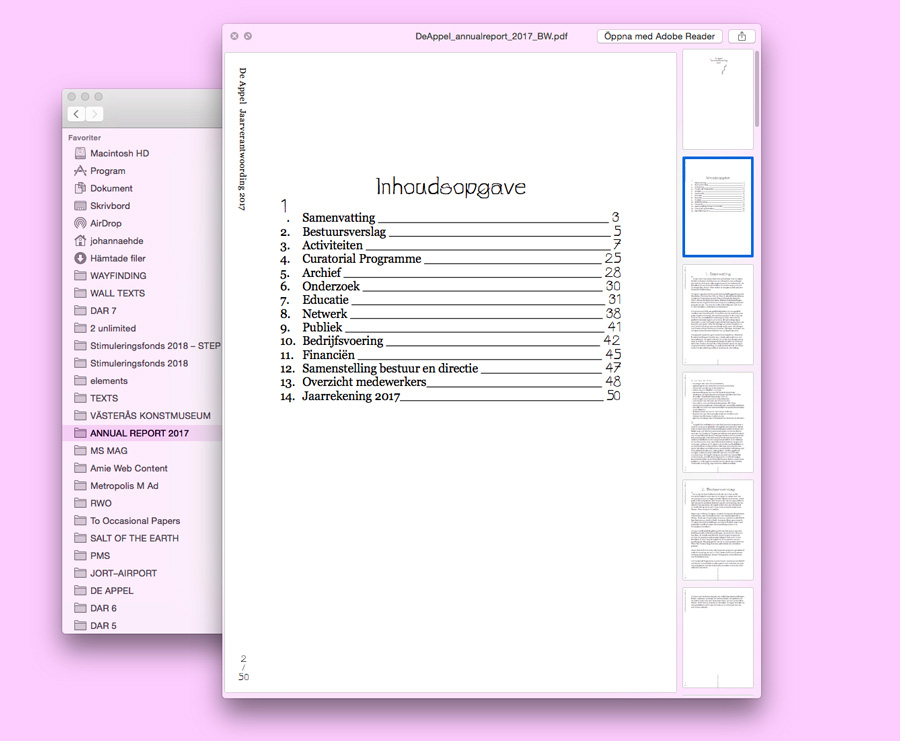
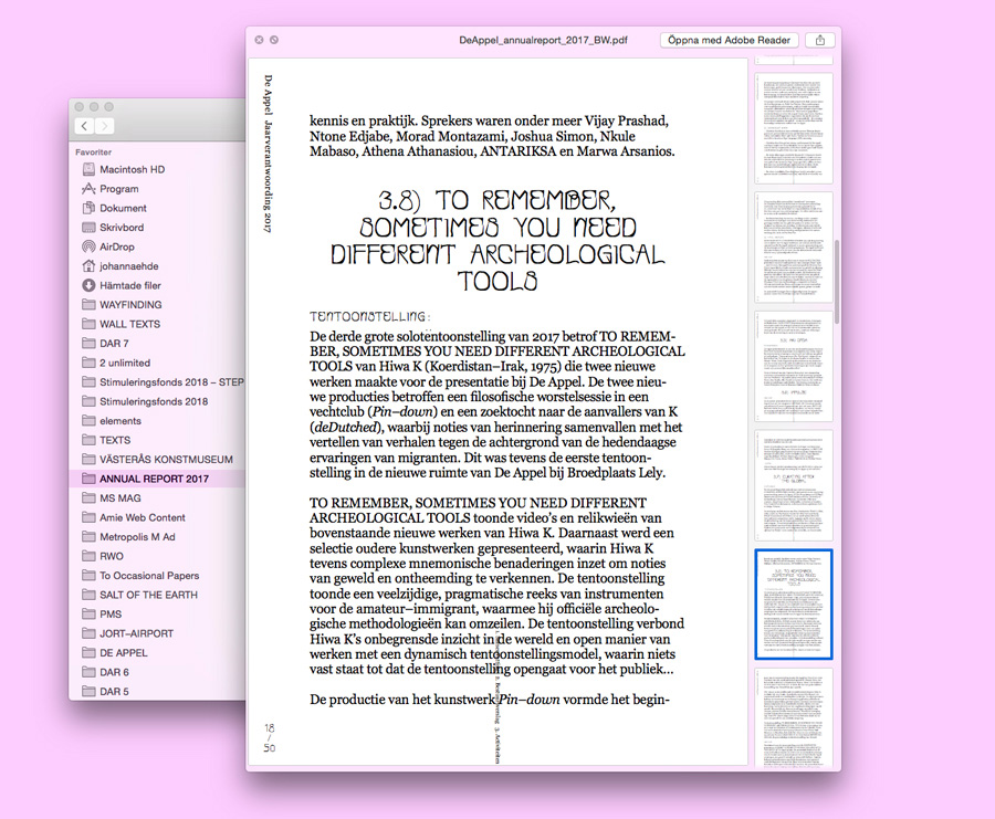
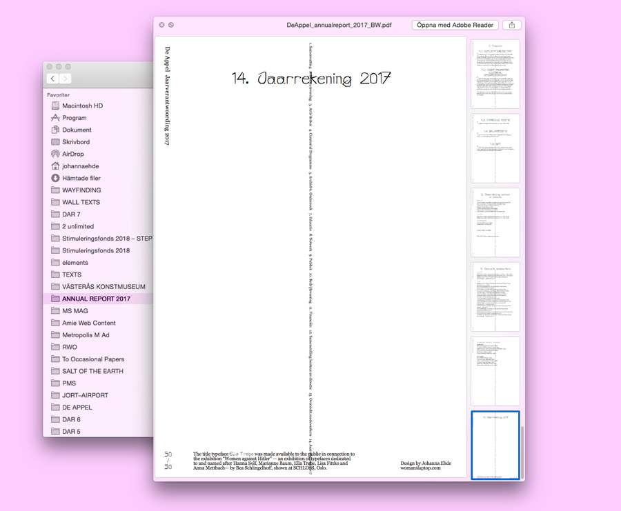
The title typeface Ella Trebe was made available to the public in connection to the Bea Schlingelhoff exhibition Women against Hitler, an exhibition of typefaces dedicated to and named after Hanna Solf, Marianne Baum, Ella Trebe, Lisa Fittko and Anna Mettbach, at SCHLOSS, Oslo.
Image DR.1
Image DR.2
Image DR.3
Image DR.4
Email Publication—De Appel Reads, Nov. 2017—
As part of the design for De Appel and their mailings De Appel Reads makes use of the email newsletter format to publish longer texts.
Image DAR.1
Exhibition Poster—The Burrow, Nov. 2017
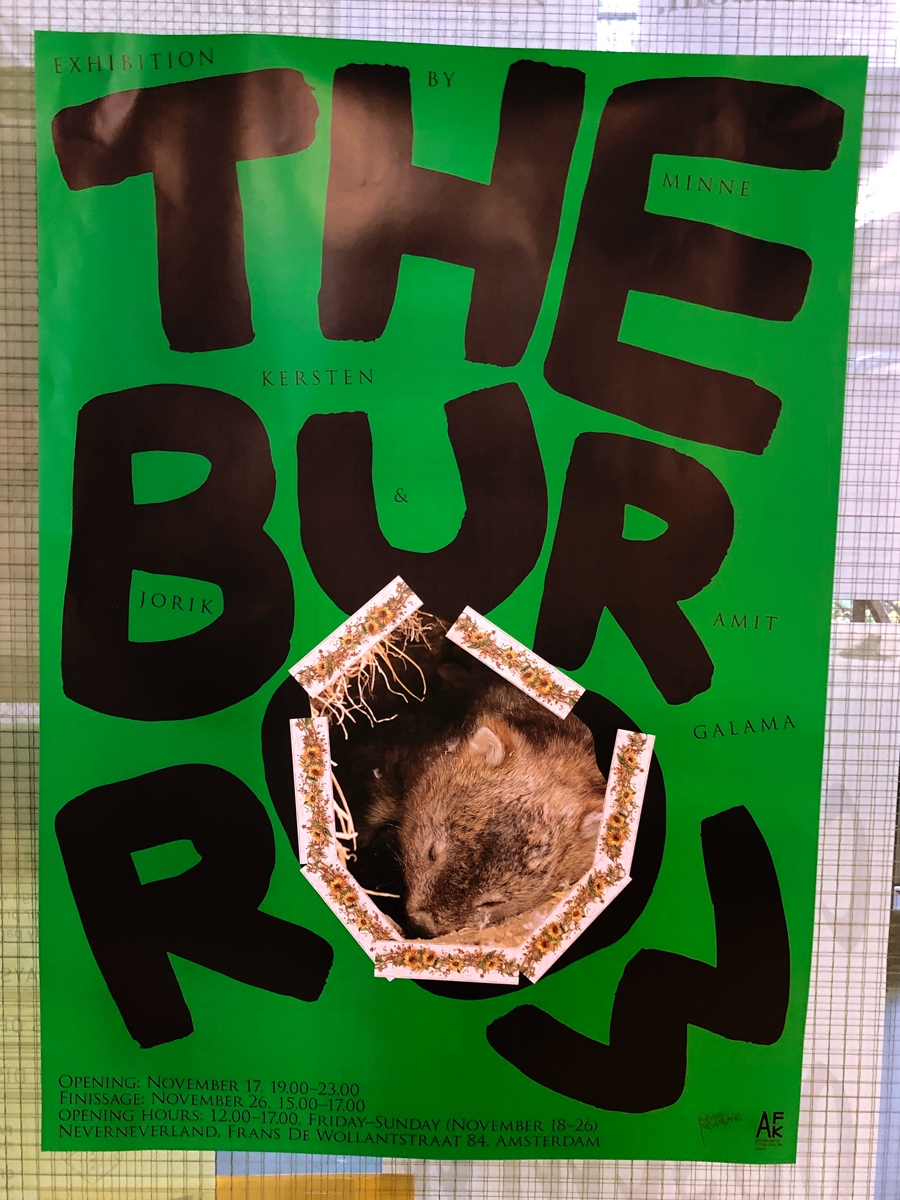
The Burrow – an exhibition about the "obsession with feeling at home" by Minne Kersten and Jorik Amit Galama, to be shown at De Punt, Amsterdam in November.
Image TB.1
Art Review Ad—De Appel , Nov. 2017
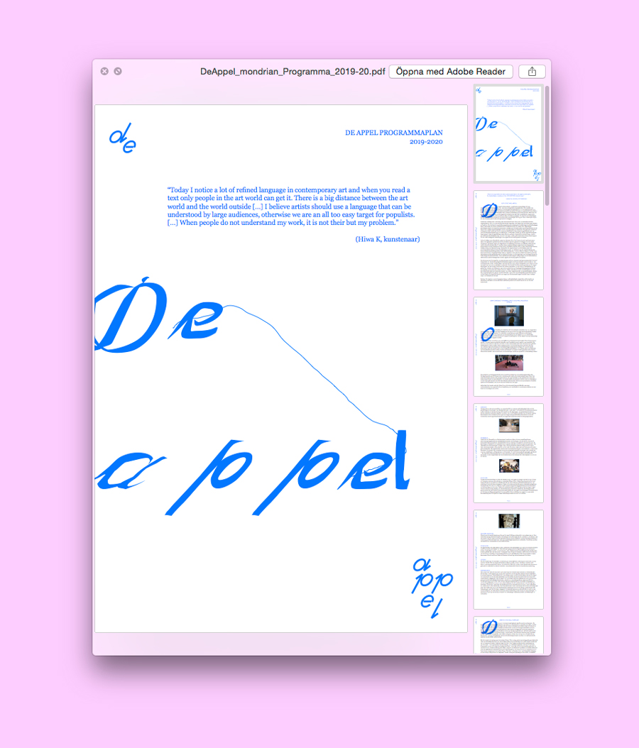
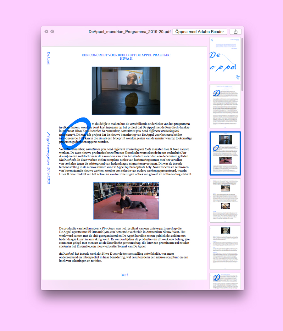
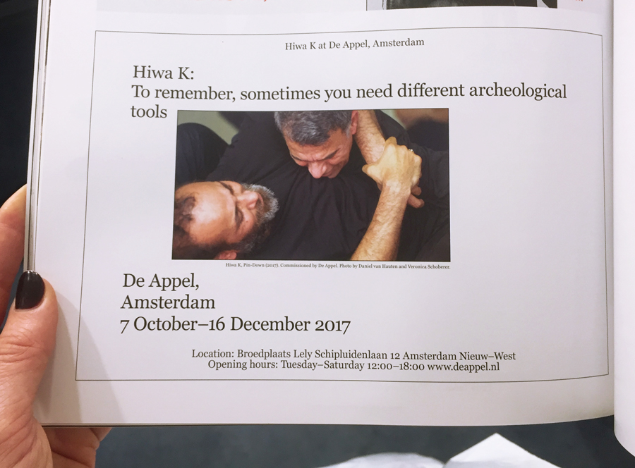
Ad promoting Hiwa K at De Appel, in the style of the De Appel Mailings.
Image AR.1
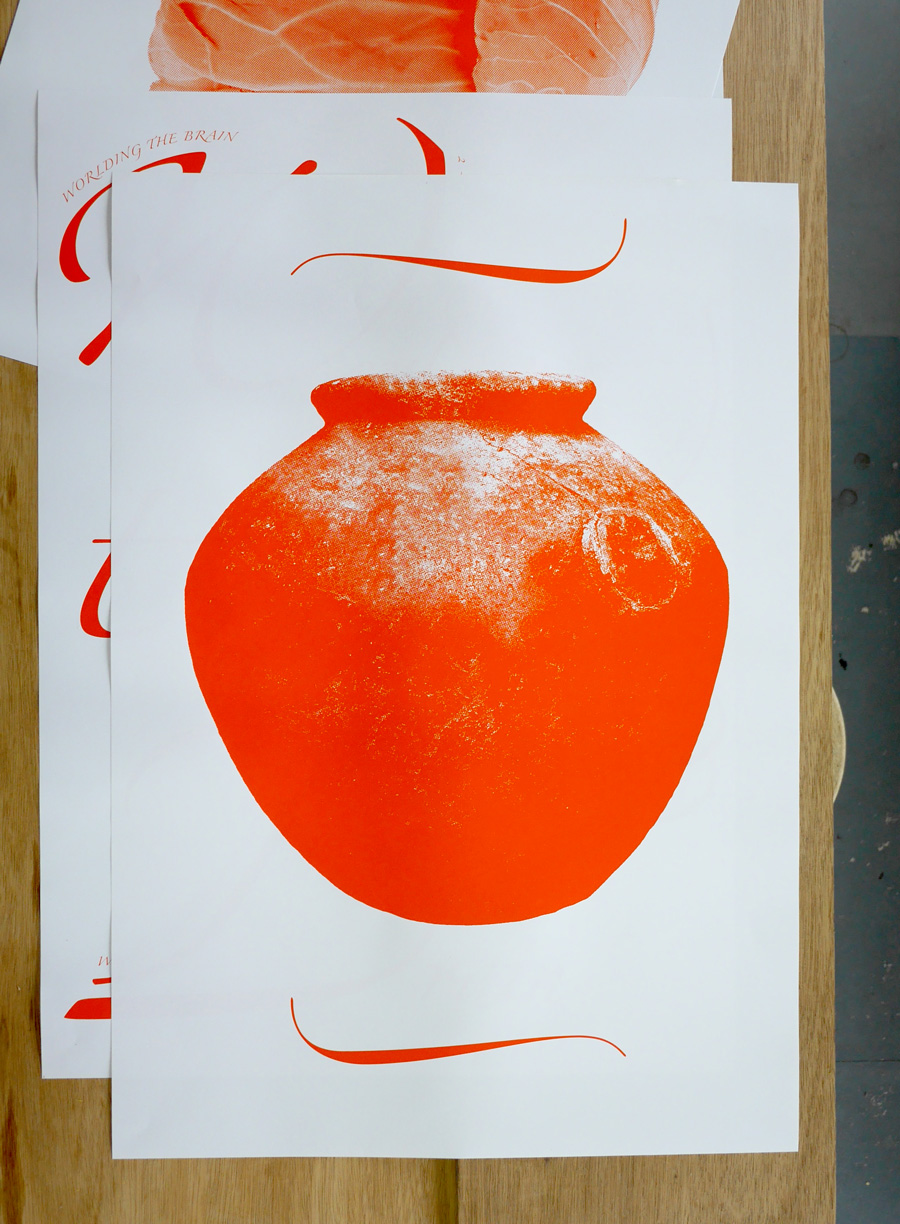
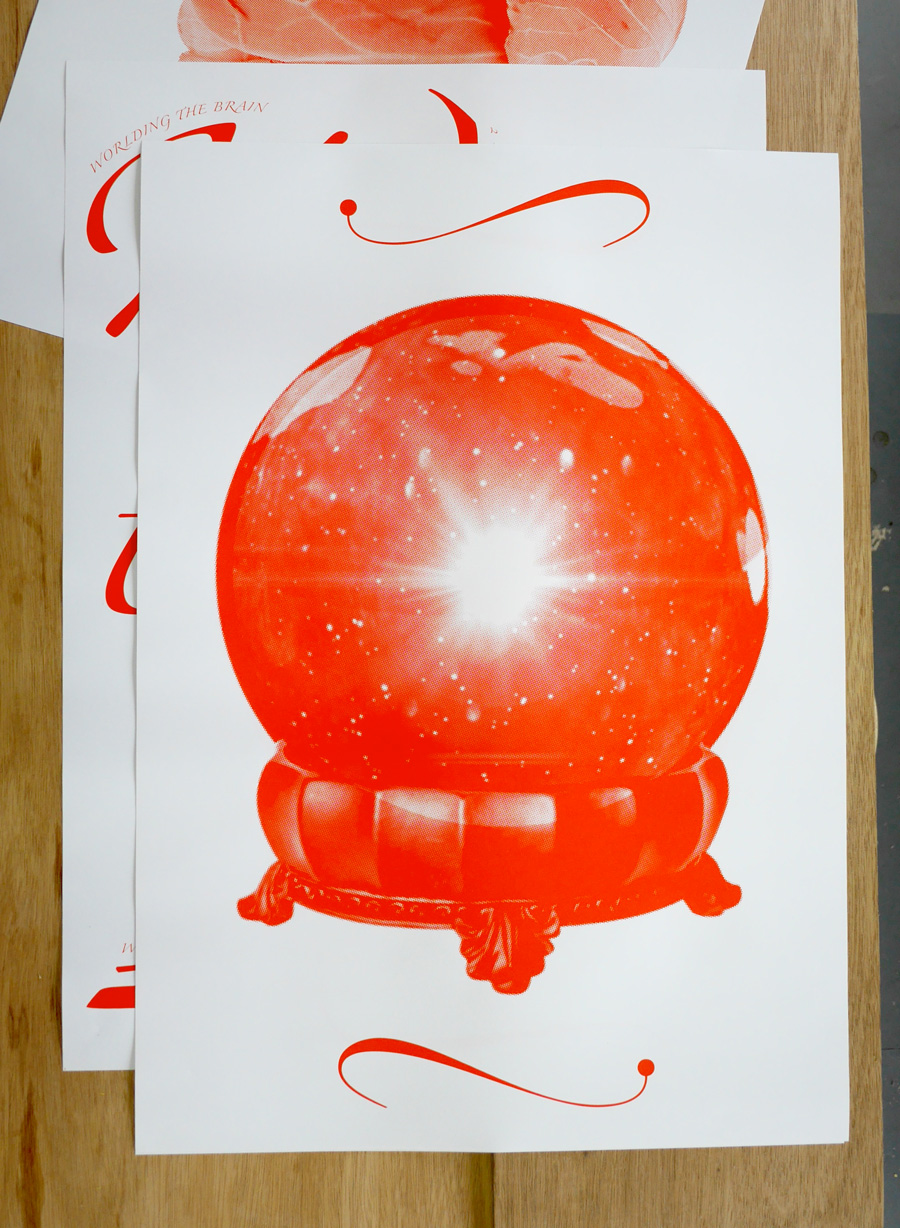
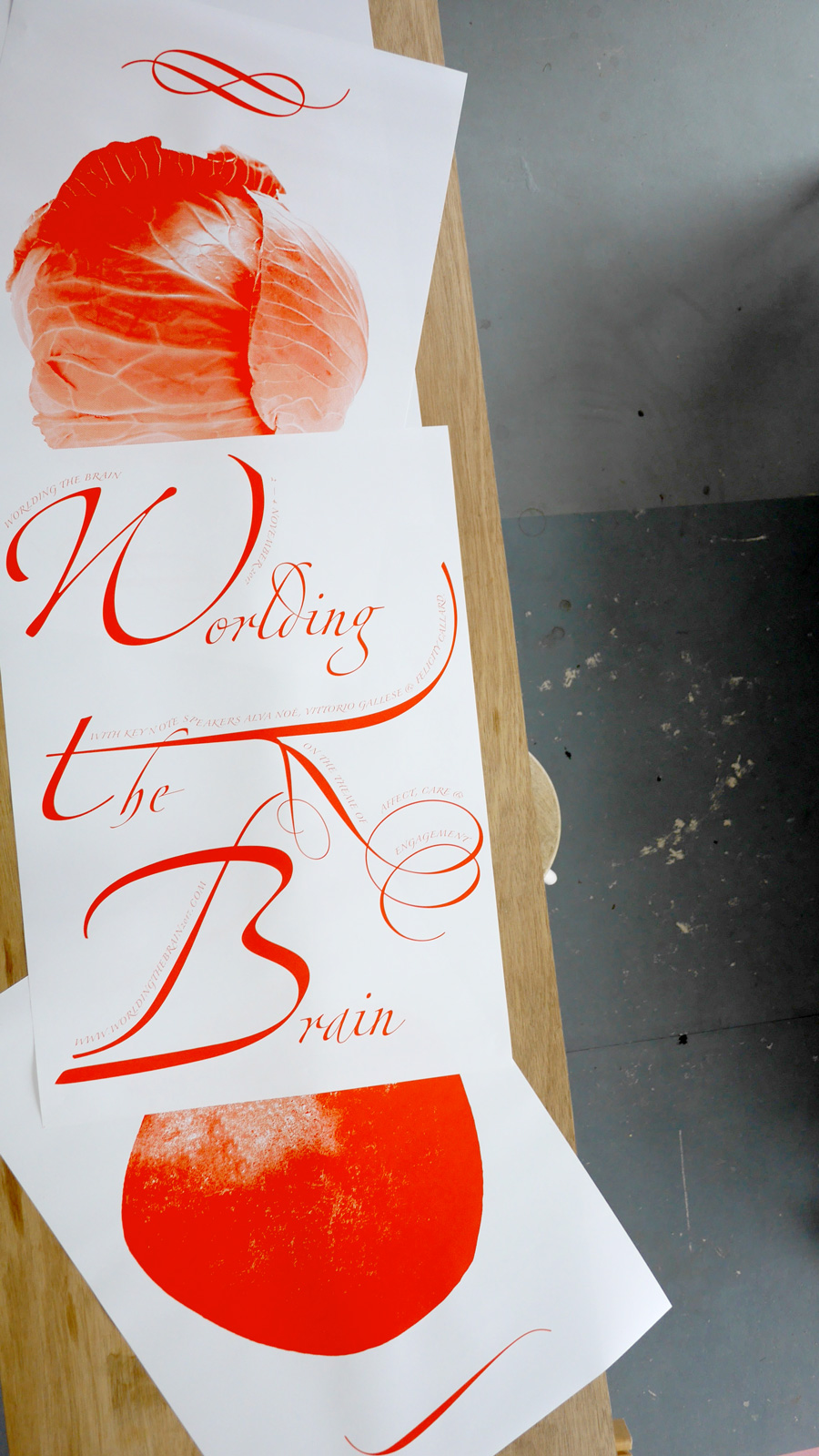
2nd Campaign for Worlding the Brain, Jul. 2017
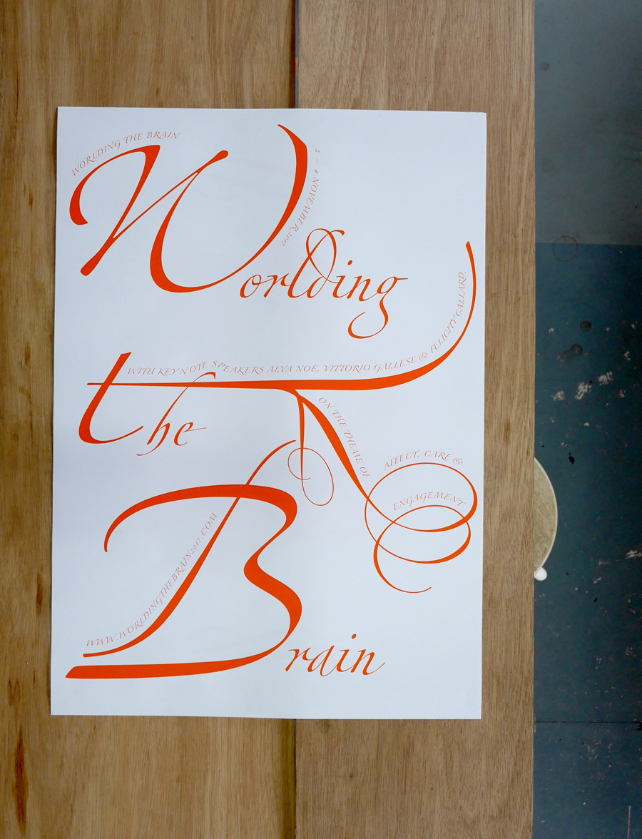
Worlding the Brain is a symposium at the University of Amsterdam, looking at the significance of the so called ’neuroturn’ in science, culture and aesthetics. This year with the focus: Affect, Care and Engagement.
Posters, pins, banners and booklet made together with Anton Weflö.
Image WTB.1
Image WTB.2
Image WTB.3
Image WTB.4
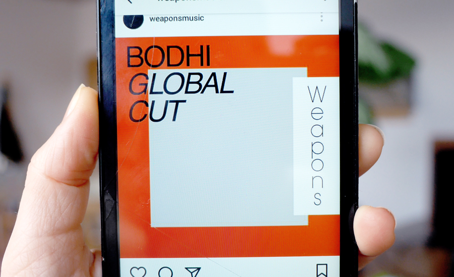
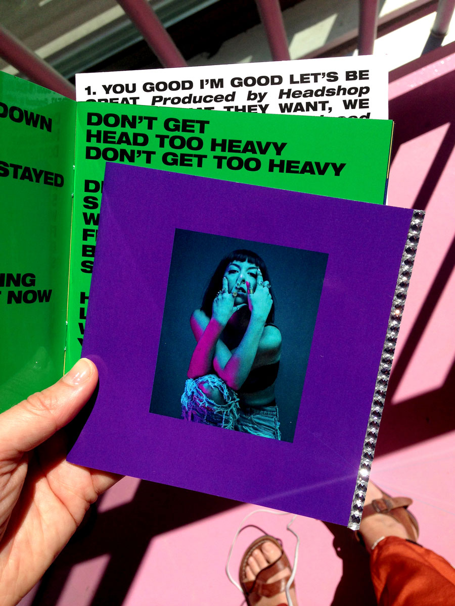
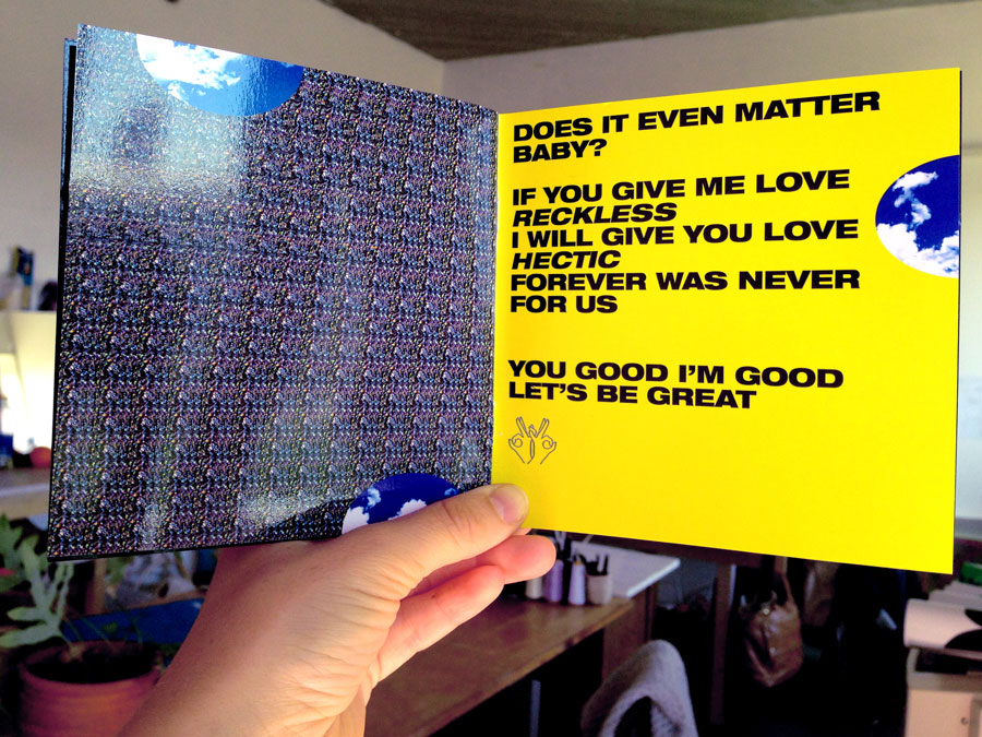
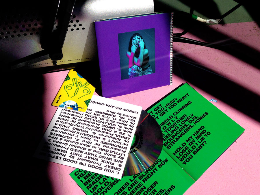
Album Artwork—GNUCCI's new album, May 2017
You Good I'm Good Let's Be Great Booklet with rhinestone cover and stereograms inside. Also: USB and CD sleeve design.
Image G.1
Image G.2
Image G.3
Exhibition—Upp och Ner Ner och Upp, Apr. 2017
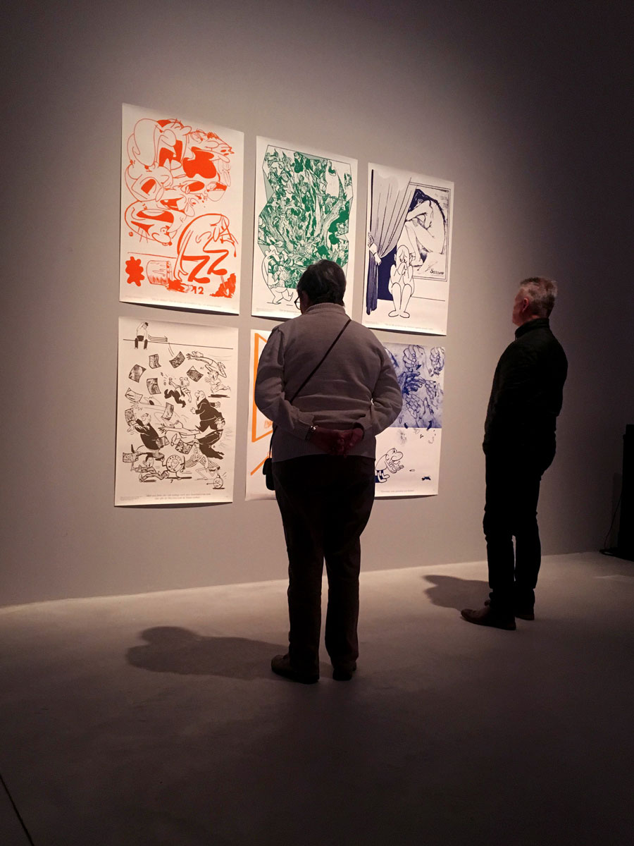
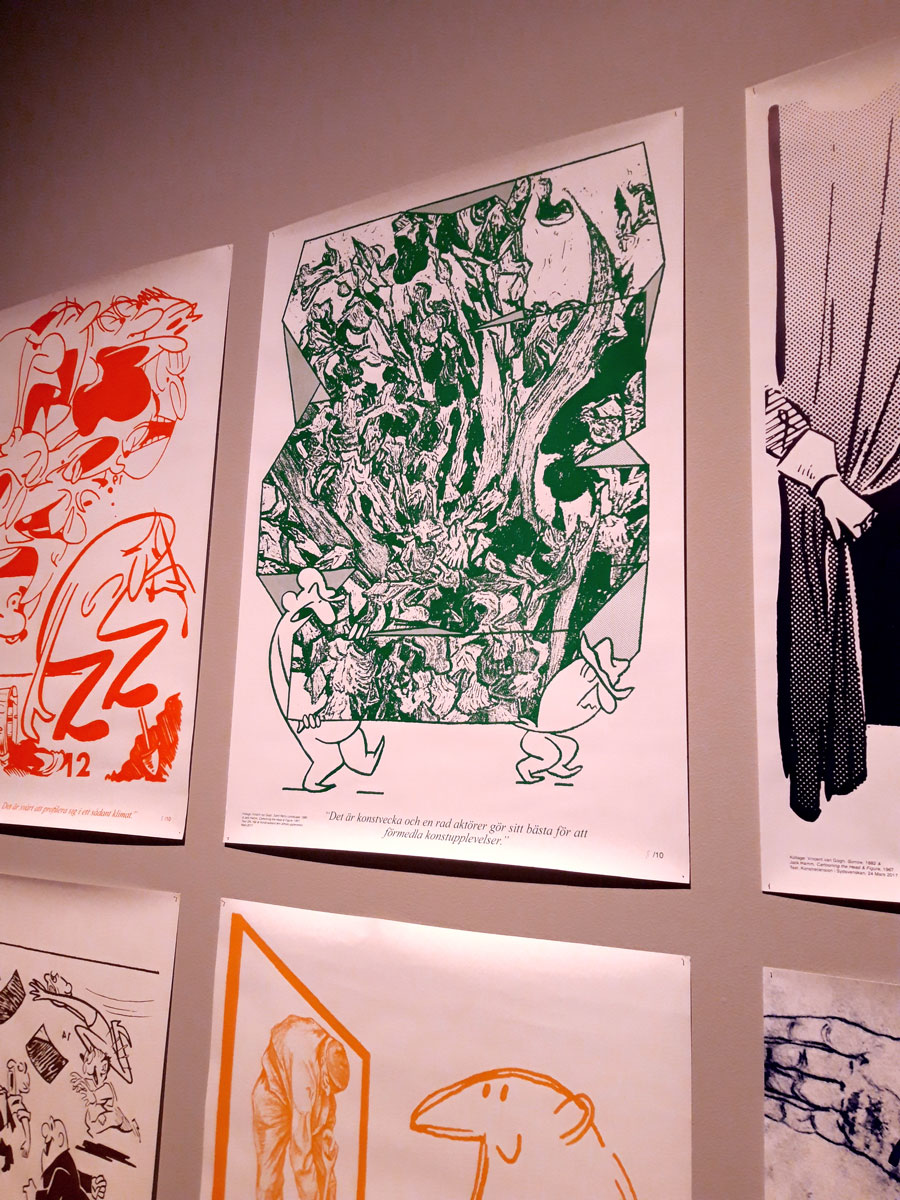
On artists and economization. Screen printed poster series and publication made together with Anton Weflö. Shown at 'Borrby Konstrunda' in Sweden. Can be seen and/or bought at Konst–ig in Stockholm. Also on view at Västerås Konstmuseum, December 2018 until March 2019.
Image K.1
Image K.2
Product Overview and Visual Identity for Senseair, Apr. 2017
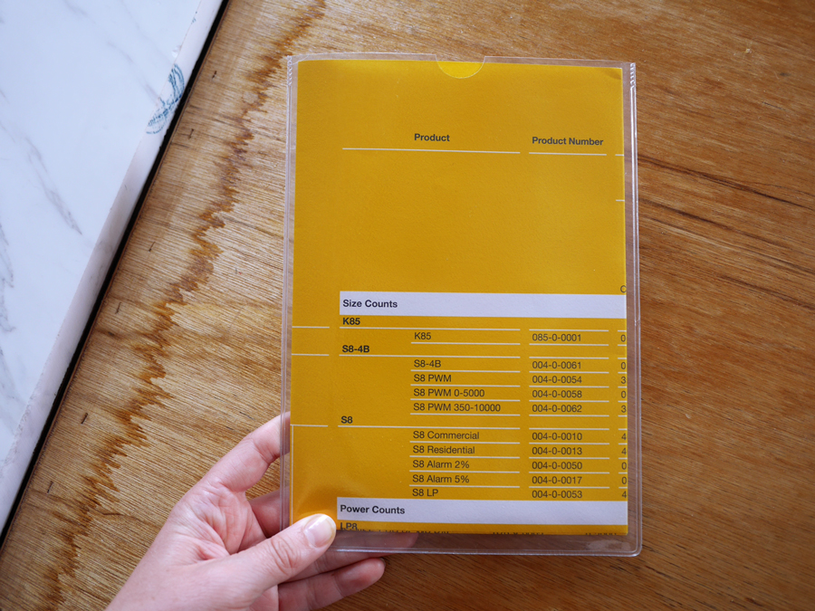
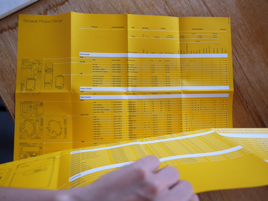
Offset printed A1 product overview for Senseair, a Swedish company that sells and develops sensors for measuring air pollution.
Image SM.1
Image SM.2
Book for Amie Dicke, Mar. 2017
Large-scale, digitally printed book as part of Amie Dicke's site specific artwork for and with the Delft archive.
Image AD.1
Image AD.2
Image AD.3
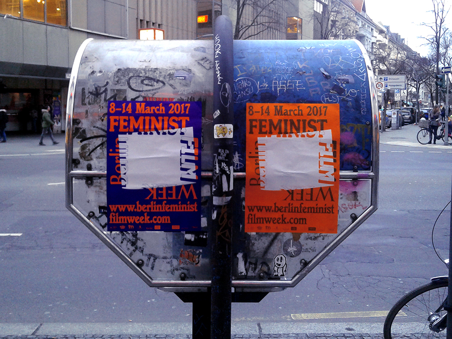
Poster—Berlin Feminist Film Week, Mar. 2017
Offset printed posters for BFFW made together with Fallon Does.
Image BF.1
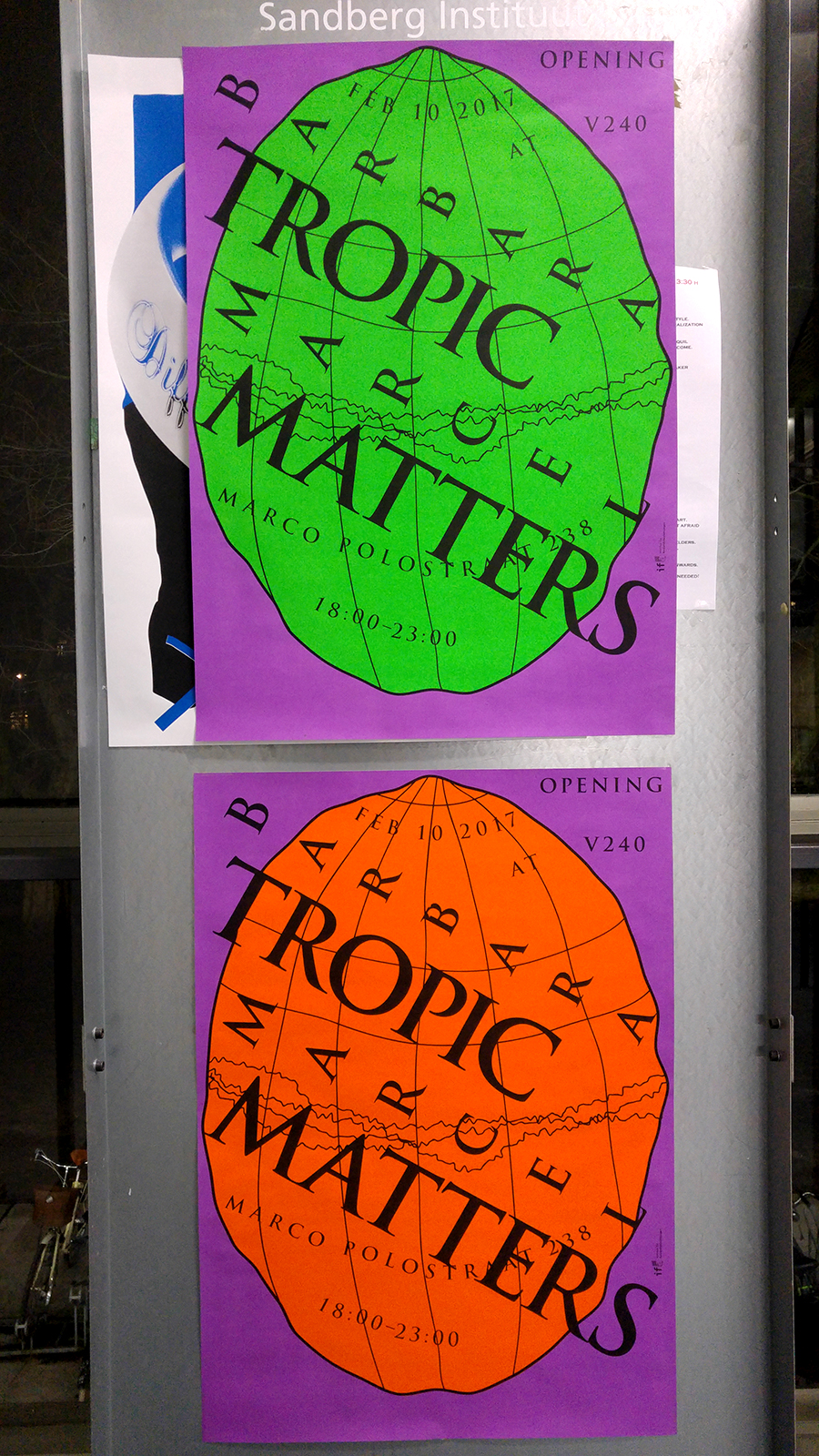
Exhibition Poster—Tropic Matters, Feb. 2017
Screen printed posters for the Barbara Marcel show at V240, Amsterdam.
Image TM.1
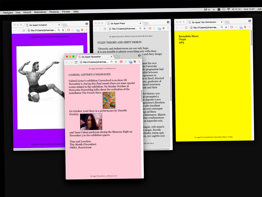
Email Newsletter Design—De Appel, Feb. 2017
Templates for De Appel Mailings: Pink Newsletter, Purple Invitation, Grey Press Release and Yellow Text Distribution.
Image DM.1
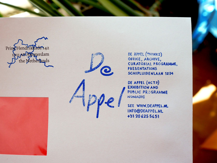
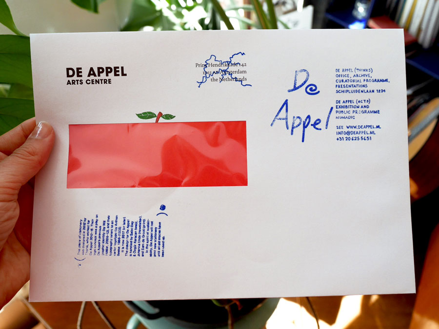
Seal/stamp—De Appel, Jan. 2017
The stamps are used freely by De Appel staff in order to reuse stationary from the old identity. (Squiggle and text block stamp by Sam de Groot) Made during the current transition of De Appel's new 'identity'.
Image DS.1
Image DS.2
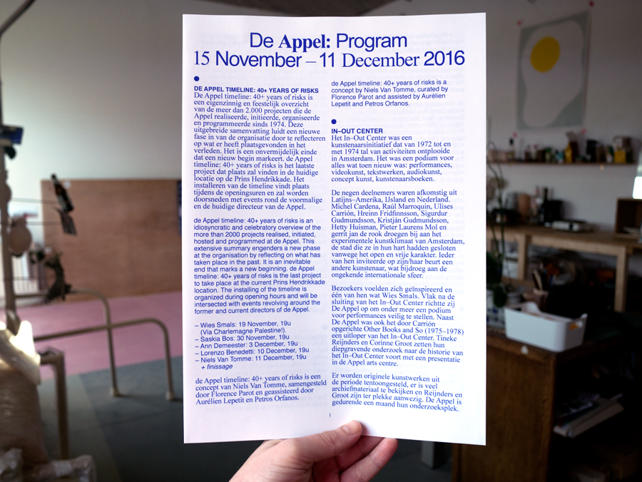
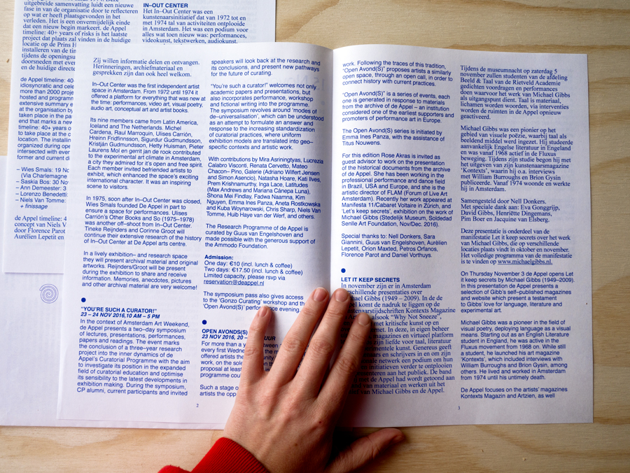
Program—De Appel, Nov. 2016
Program design for the month of November. Made during the current transition of De Appel's new 'identity'.
Image DA.1
Image DA.2
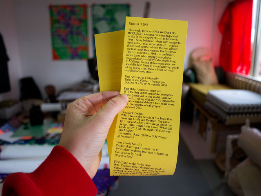
Exhibition—Sorry! NO We Don't Do REQUESTS, Oct. 2016
Contribution to Sorry! NO We Don't Do REQUESTS, an exhibition of twenty years of Will Holder's work presented through selections made weekly by different guests (Sara de Bondt, Linda van Deursen, Johanna Ehde, Elisabeth Klement, Maxine Kopsa, Mason Leaver-Yap, Kaisa Lassinaro, Riet Wijnen and Felicia von Zweigbergk) at Kunstverein in Amsterdam, NL.
Bookmark for selection.
Image SN.1
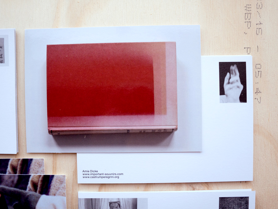
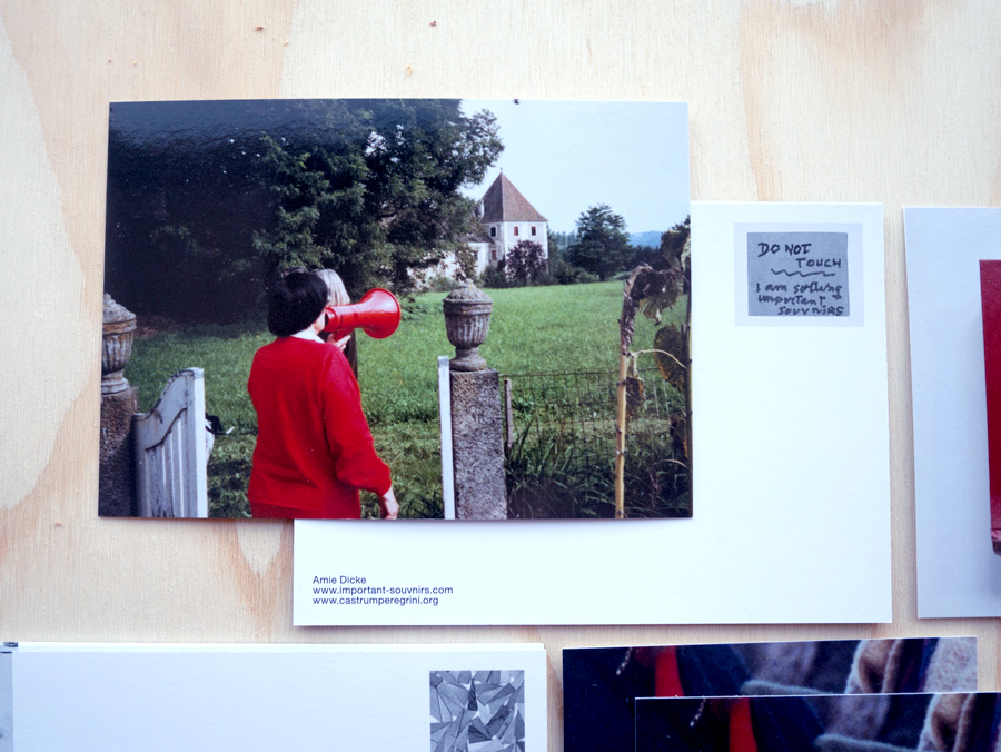
Postcards, handout, book—Important Souvnirs, Oct. 2016
Exhibition material for Amie Dicke's show important souvnirs at Gisele's house, Castrum Peregrini, Amsterdam. Each postcard was made in response to the works of Amie Dicke and the image selection came from her archive important souvnirs.
Postcards were stacked as signage for each work, A4 handout/floor plan.
Image IS.1 Image IS.2
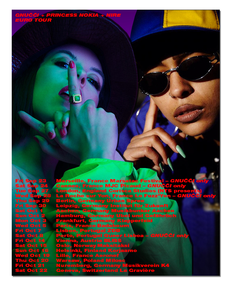
Poster—Gnučči, Princess Nokia, and Nire, Sep. 2016
Poster design for the 2016 euro tour of Gnučči, Princess Nokia, and Nire.
Image GPN.1
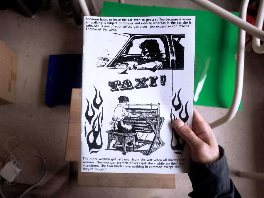
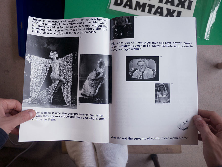
Graduation project—Lady Taxi, Jul. 2016
The project Lady Taxi involved a one week free of charge cab service for (mainly elderly) ladies. The underlying questions of the project revolved around women's labour (both underpaid and unpaid) and the proposed invisibility of the old woman in a society that values youth culture and salary work. Shown at the Gerrit Rietveld Academie graduation show.
Video installation, Taxi roof light, hand made car accessories, screen printed posters and publication.
Image LT.1 Image LT.2
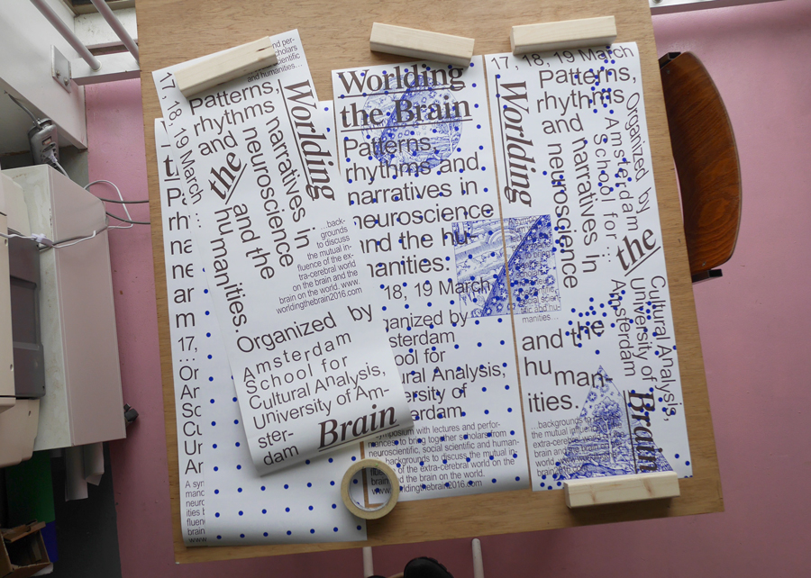
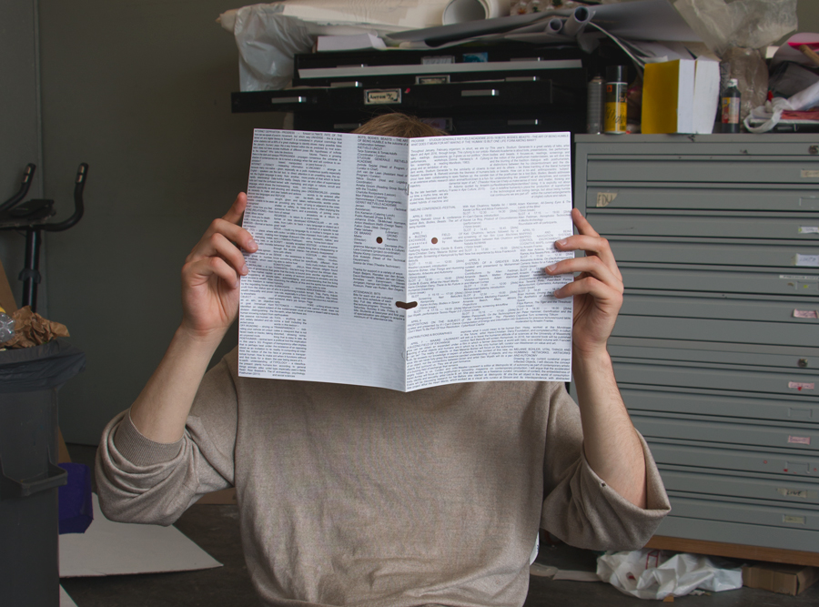
Conference material—Worlding the Brain, Mar. 2016
Identity for ’Worlding the brain’ – a symposium looking at the significance of the so called ’neuroturn’ in science, culture and aesthetics. The identity included screen-printed posters to be puzzled together in different combinations, a risographed booklet cover, GIF animations and small pins.
Made together with Anton Weflö.
Image WB.1
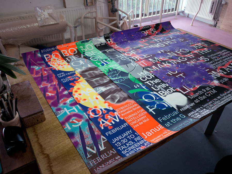
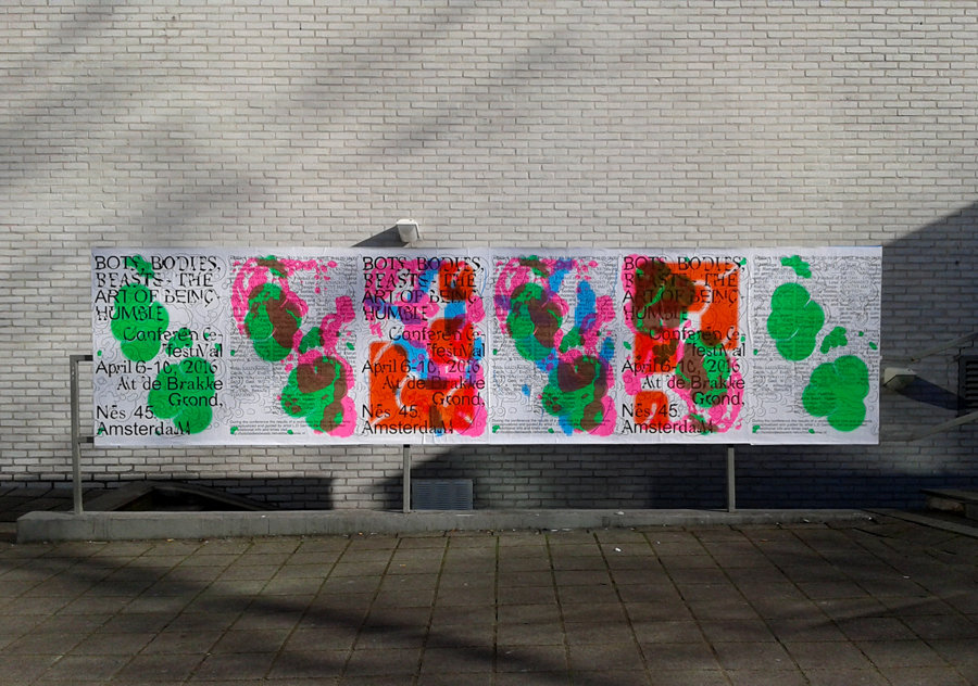
Gerrit Rietveld Academie Studium Generale Campaign—Bots, bodies, beasts, Nov. 2015-Mar. 2016
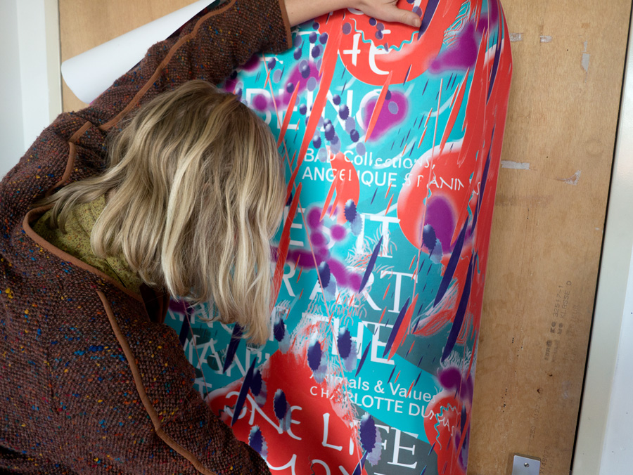
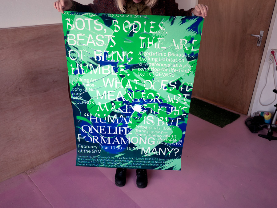
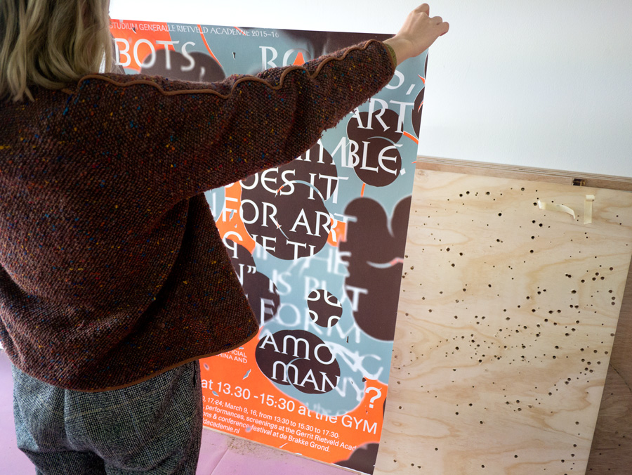
Campaign made together with Anton Westbom Weflö and Till Hormann. The title was "Bots, Bodies, Beasts - The art of being Humble. What does it mean for art making if the "human" is but one life form among many?" This theme suggested a blurring of the three categories. The blurring resulted in alternative meanings and ways of (not) reading. Fallon Does helped with the website which you can visit here.
Image SG.1 Image SG.2 Image SG.3 Image SG.4 Image SG.5 Image SG.6
Folder—Toyota Corolla “Fan drawings”, Nov. 2015
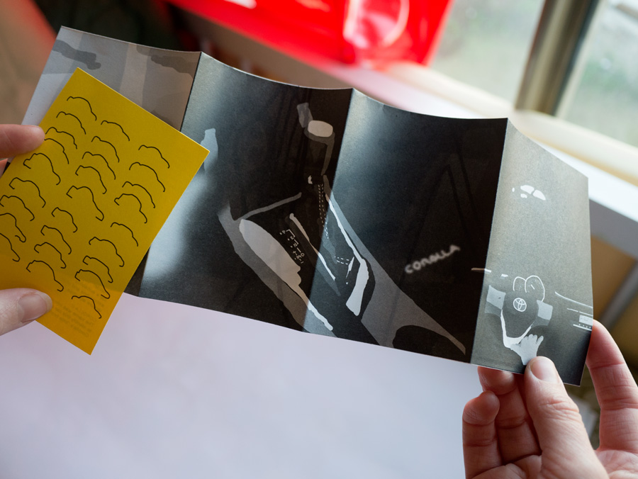
Toyota Corolla is one of the world's most successful products. It is a very reliable and economic compact car. This is probably why corolla owners are so loyal to the model. Drawings in offset printed A6 folder.
Image TC.1
Poster and flyer—Heresies, May 2015
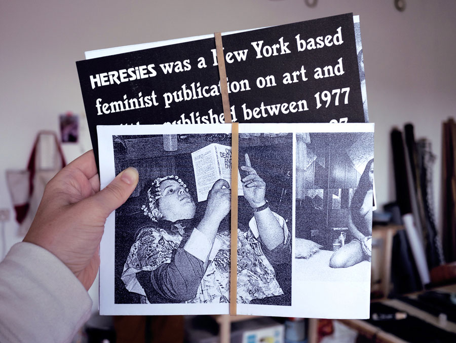
Promoting Heresies by 'republishing' a selection of images on a poster. Heresies was a New York based feminist journal on art and politics, published between 1977 to 1993. All the issues are available for free here. Folded A1 poster with risographed flyer.
Image H.1

